The Project Pegasus Saga Part Two (Marvel Two-in-One 56, 57, 58, 1979)

The next few issues of this great story saw a change in art, but not in tone for sure. You still get action supreme, and we really see what Ben Grim is made of as not just a superhero, but a man. We also get Bill Foster in action, Quasar showing off his abilities, and the mysterious Wundarr as well! After all is said and done, Wundarr fell a little flat, but Thundra was awesome! One thing to note about issue 56- the Thing and Thundra brawl, and as older readers know, this isn’t anything to get worked up over. In this day and age, you’ll be hard-pressed to see a brawl between a male and female characters in a mainstream book.

Props definitely need to be given to Mark Gruenwald and Ralph Macchio (writers). In only six issues, they utilize at least fifteen different characters in this setting (plus a flashback or two), and get more out of them than all their previous appearances combined! They do a great justice to Bill Foster especially. The artwork by George Pérez (pencils) and Gene Day (inks)(and one cover, 56, by John Byrne and Terry Austin), is very solid. I’m not very well versed in Day’s career, but Pérez is dynamite. Some of the pages of the issues I own, are a little muddy, and seem more like a printing issue than the artist’s not doing their job. Names like Bob Sharen and Carl Gafford (colors), Irv Watanabe and John Costanza (letters), and Jim Shooter (editor), round out the creative force behind this gem!


img290

img291

img292

img293

img294

img295

img296

img298


The Project Pegasus Saga Part One (Marvel Two-in-One 53, 54, 55, 1979)!

As of now, you can buy a deluxe hardcover of this great story, but back in the day, you had to grab the single issues. One of my favorite off-beat books of all time is most certainly Marvel Two-in-One! The title almost always featured Ben Grimm, and this Jack Kirby creation is one of the best characters to spring from his incredible mind. When thrown-in with another character, Grimm really shines. His personality is often repressed slightly when issue after issue of Fantastic Four he was portrayed as just muscle (with exception of an issue here and there). His sense of humor really shined in these stories, and solidified him as one of Marvel’s greatest characters.

One of the names synonymous with Marvel Comic’s history is Mark Gruenwald (writer). His days as an editor, writer, and overall continuity cop are nothing short of legendary. Along with Ralph Macchio (writer), these two men gave us an epic story that endures! If you need two men to render a story, you might as well get John Byrne (pencils) and Joe Sinnott (inks)! Toss in names like Bob Sharen (colors), John Costanza (letters), Diana Albers (letters), George Pérez (cover pencils to 55), and Roger Stern (editor),  and the dream team is set!


img168

img169

img170

img171

img172

img174

img175

img176

img177

img178

img179


SGT Fury and His Howling Commandos 166, 1981 “Play it Alone, Sam!”

Every once in a while, I feel the urge to spotlight a war/military comic. One of my favorites is Sgt. Fury and His Howling Commandos! I’ve always loved the concept of a rough and tumble team that could handle anything. The mixture of personalities, and different ethnic backgrounds was pretty cool. There were down times with humor and fun, but when it was time for action, they were ready! This issue in particular was good because not only was the regular cast there but also their CO (Commanding Officer), Happy Sawyer! In this story (a bit of a Casablanca rip off), we see Sawyer remembering a mission that saw him fighting everyone from Arabs, French, and Nazis!

Although sometimes war/military books can get redundant, this one (along with War is Hell) were always pretty good. This issue had Gary Friedrich (with changes by Allyn Brodsky) scripting, and we all know that Gary wrote some fantastic stuff back in the Bronze Age (Ghost Rider, Frankenstein). The interior pencils are by Dick Ayers, and inks by John Severin. Both of these gentlemen don’t get mentioned anywhere near as much as they should, so definitely check out there work and give them their due! Colors by Bob Sharen, and letters by Jean Izzo. The cover was by John Severin (originally Sgt Fury 72, 1969)!


img109

img110

img111

img112

img114

img116

img117

Machine Man 11, 1979 “Byte of the Binary Bug!”

The title “Machine Man,” was from the incredible mind of Jack “King” Kirby. As with virtually everything he touched, the book was great, but his run only lasted for the first nine issues. After that, it took a strange turn when Steve Ditko took over the artistic duties. This story brings in a techno-villain that seems to have what it takes to not only commit daring crimes, but also to stop Machine Man as well! A wild story with a tragic ending, as only Marvel in the Bronze Age can supply!

The man named Marv Wolfman (writer/editor), must have lived in the studio during the Bronze Age. Between the writing, plotting, and editing, his resumé is ridiculous. He’ll always be a legend for his collaboration with Gene Colan (Tomb of Dracula), but he was always a consistently good writer no matter what title. Steve Ditko (interior art and cover) needs no introduction or hyperbole thrown his way. If not for him, Spider-Man wouldn’t be the iconic character he is today, period. Michele Wolfman (colors) and John Costanza (letters), round out the creative team!


img087

img088

img090

img091

img092

img093

Cinema Sunday: The Abominable Dr. Phibes

phibes

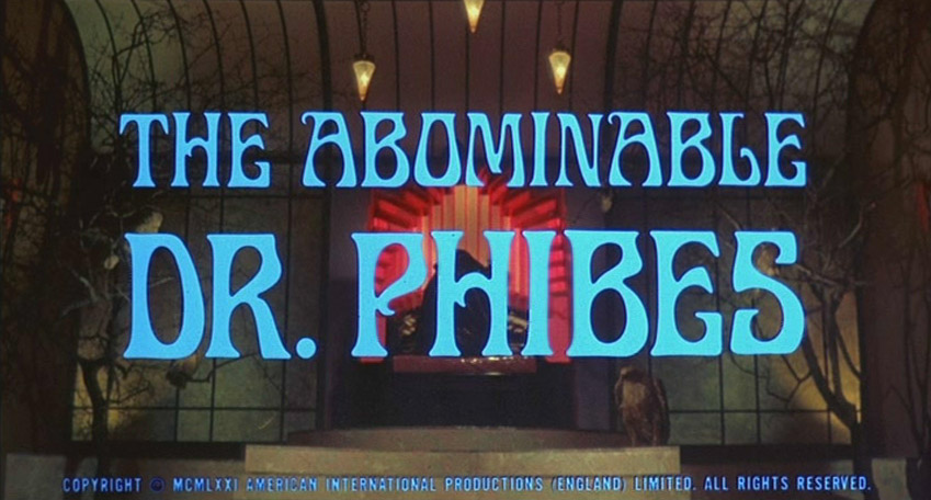
Title: The Abominable Dr Phibes

Distributor: MGM/AIP

Writers: James Whiton, William Goldstein, Robert Feust (uncredited)

Director: Robert Feust

Producers: Ronald S. Dunas, Louis M. Heyward

Starring: Vincent Price, Joseph Cotten, Hugh Griffith, Terry Thomas, Virginia North

Released: April/May, 1971

MPAA: PG-13


phibes title


As you’ve probably noticed by now, I’m rolling with one movie review a month, plus scaling back on my comic book reviews as well. Everyday life is not permitting much else I’m afraid, but don’t fret, because the minute it does…alright, no promises, because I’ll probably just vacation more if/when that happens! But, for now we’ll be strolling down a dark lane that leads to a guy in a creepy mask that plays an organ. Yes once more, a Vincent Price film we’ll be featured! This is one of his later films (he’d already been acting in films since 1938!) but one of his best, no doubt about it!

This film is one that all Price fans must see if they already haven’t. It differs quite a bit from most of his other films because of the sets, the character’s demeanor, humor, and overall creepiness. Some of the scenes in this flick are quite disturbing, and the biblical references (the Ten Plagues), add a really crazy touch. Alright, no more hype, let’s get down to business!


phibes1

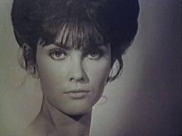
The film begins with a robed man playing an organ (roll credits). It’s rising from a lower level to a sort of ballroom. We see what looks like an orchestra as well, but we soon realize they are just automated figures. The robed figure begins to play conductor, and the automatons play music. A side door then opens, and a beautiful woman, Vulnavia (Virginia North) wearing a white gown appears. The two embrace, and strut towards the center of the ballroom, an begin dancing. Eventually, the woman heads up to the second level balcony. The robed man grabs a wrapped object, and they get into a car, and hit the road.


phibes4

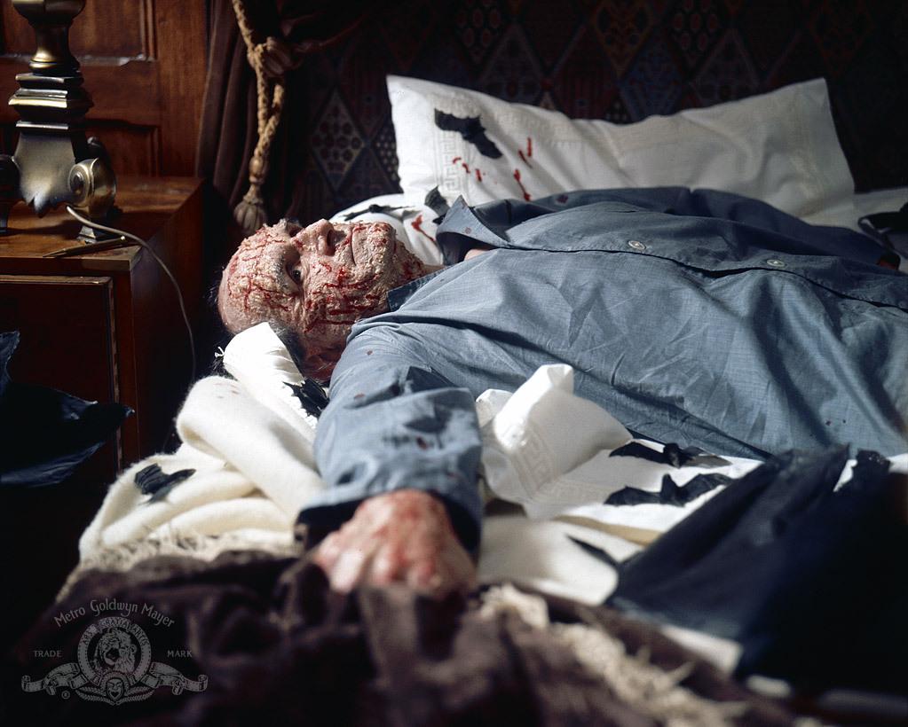
Meanwhile, across town, an older gentleman is bedding down for the evening. He shuts off his lamp, and attempts to slumber. Outside of his home, the car with the robed man and Vulnavia pulls up. As the man sleeps, a skylight over his bed opens, and a cage is lowered into the room. The cage empties, and is then raised back through the skylight and it is shut. After hearing some rustling noises, the man awakens to find his bedroom infested with bats. And they must be starving because they attack and kill the old man (presumed now, but told shortly after).


phibes3

The car returns home, and the robed man returns to his organ playing. The following day, a butler discovers the old man dead, and the room covered in bats. Back at the robed guy’s house, he puts a necklace on a wax figure of the dead old guy, then melts it with fire. The police finally arrive at the home of the dead man, and they remark about the peculiar nature of the incident. Inspector Harry Trout (Peter Jeffrey) and Sgt. Tom Schenley (Norman Jones) conduct an investigation, and talk of another recent case where another doctor (apparently the dead guy as a surgeon), was killed in his library by a swarm of bees.


phibes2

Back at the creepy house, we see the robed guy at a table where he has pieces of a face made of rubber or some such material. He picks up a nose, then two ears, then grabs a wig. We then get to finally see Dr. Anton Phibes (Vincent Price), in all his glory (although it was believed he died in a car accident years earlier)! He goes back over to his organ, and begins to belt out a tune. Later, a cocktail party is buzzing with life. This isn’t a regular party though, as all the participants are wearing ornate masks. One man, Dr. Hargreaves (Alex Scott)  enters and is given a frog mask. He remarks at how he’s not a surgical doctor, but a psychiatrist…a “head shrinker,” if you will. We can now realize that the man giving him the mask is Phibes, and he gives a glaring look when the doctor makes the remark. He helps strap on the mask, and locks it. As Phibes watches, the mask begins to tighten,  and eventually crushes the skull of Dr. Hargreaves.Blood begins to pour out of the mask. Once again, Phibes puts a chain around the neck of a wax figure resembling the victim, then melts it with a torch.


phibes5

But, why is this disfigured man murdering doctors? And what does his dead wife have to do with these murders? All will be revealed when the time comes!


OK, here are my thoughts:

This film is nothing short of extraordinary. The sets are remarkable and allow ones mind to float off into a head trip of sorts. Bright colors, followed by darks, then throw in some lighting and wild music, and you’ve got something very unique. Of course, Price adds his immense talent to the film, and portrays this murderous figure as a sympathetic character that you end up feeling sorry for in the end.

Whether it was the sets, makeup, costumes, cast, or anything else, you can’t go wrong with this flick. It’s definitely one of Price’s masterpieces, and AIP (American International Pictures) should be commended as well for the films excellence. A seminal piece for sure, the film is one of the best of Price’s career and of the decade.


Click here for the trailer!


munro_phibes

Daredevil 124, 1975 “In The Coils of The Copperhead!”

Back again, and this time I have another shot of Daredevil for you! The silly villain this time around is called “Copperhead.” It seems that Daredevil has competition out there in the form of a person imitating a character from a pulp book from the 1930s. This man has no regard for life (sort of like the Punisher), and lays down judgement on wrongdoers all over the city. It’s up to Mr. Murdoch to try to stop this renegade, if he can! Copperhead is no joke…OK, he is but he does have poison tipped darts that he shoots out of his gun, and a diamond hard mask to protect his identity! Plus, we get some political drama with Foggy as well in this issue!

I’m not quite sure why, but the issue is written by Len Wein and Marv Wolfman (he was the steady writer around this time, and Wein the editor). No matter though, as both guys gives us the straight forward dialogue you came to expect from this title in the Bronze Age. The artistic team is one that I’m torn over. Gene Colan (pencils) is without a doubt my favorite penciler of all time. He’s so uniquely talented, you’ve got to love the guy’s work. The inks are provided by Klaus Janson. His work with Frank Miller on Daredevil in the 1980s is fantastic, as is his solo work. He just doesn’t seem like the best match for Colan’s pencils. The colors are provided by Michele Wolfman, and the letters by Joe Rosen. We also get a great cover by the team of Gil Kane (pencils) and Frank Giacoia (inks)!


img077

img078

img080

img081

img082

img084

Daredevil 129, 1975 “Man-Bull in a China-Town!”

Has there ever been a better title for a story than this one? Exactly. Lame villains are what make the world go ’round, as we all know. Daredevil has seen his fill of these wacky characters, and it’s why I love this title during the Bronze Age! The book got way too serious for me once Frank Miller took over (even though, I still enjoy some of those stories). But wacky stories involving characters  like the “Man-Bull,” are just too awesome to not spotlight. The man without fear versus a guy that’s part man, part bull…what’s not to like?

Seeing the name Marv Wolfman (writer/editor), at the helm always puts me at ease. Whether it was Tomb of Dracula, Batman, or Crisis on Infinite Earths, the guy gets it done. Not the most well known tandem in comics, but Bob Brown (pencils) and Klaus Janson (inks), do hold their own and give us some nice visuals. Michele Wolfman (colors) and Joe Rosen (letters), round out the interior creative team! As usual, we get a cool cover, and the team of Rich Buckler (pencils) and Klaus Janson (inks) are responsible!


img069

img070

img071

img073

img074

img075

Fantastic Four Annual 11, 1976 “And Now, The Invaders!”

Returning to the corner of the Marvel Universe occupied by Marvel’s first family, I thought it would be appropriate to focus on an amazing annual from the Bronze Age. In FF 169, Luke Cage was under the sway of the Puppet Master, and attacked the Fantastic Four. While he was going crazy, he knocked some Vibranium into Reed’s time machine. It was transported back to WWII era, and into the hands of the Nazis. With this awesome weapon, it looked as if the Allies would be defeated, and the world would live in tyranny. The FF then uses the time machine to hurl themselves back in time to help the greatest team of WWII, The Invaders, stop the Nazis and Baron Zemo!

This era of Marvel will always be my favorite, as Jack Kirby (cover pencils, inks by Joe Sinnott) returned to do some great covers like this one. Not to be outdone, is Mr. editor/writer/everything man, Roy Thomas, as he adds his uncanny ability to write team books. And this one has two great teams in it! One of my all time favorite artists, is “Big” John Buscema (pencils). His pencils are always a treat to see, and the inks of Sam Grainger compliment him well. Colors by Phil Rachelson, and letters by Sam Rosen!


img040

img043

img044

img045

img046

img047

img048

Doctor Strange 29, 1978 “He Who Stalks!”

Another post about Doctor Strange, and this one is another favorite of mine. One of the reasons is because it has several guest appearances. The tale centers around the Doc and Nighthawk (both heroes are members of the non-team “The Defenders“), as they face off against a villain that’s been in the pages of Daredevil during this era as well. The Death-Stalker is a very mysterious villain and a sinister one too that has the power of intangibility, and a “death touch” that renders lesser men dead!

In his long career, Roger Stern (writer) has written some very compelling stories, and had some lengthy runs on titles. Of course, most everyone will gravitate to his Amazing Spider-Man work, or his tremendous collaboration with John Byrne on Captain America, but don’t sleep on his Dr. Strange stories because they are great! Tom Sutton (pencils) is most noted for his horror work, but given the opportunity, he can draw a wider range of material. Veteran artist Ernie Chan (inks) is always a welcome sight in the credits box, because he was a very solid artist that put in good work. Petra Goldberg (colors), Annette Kawecki (letters), and Archie Goodwin (editor), round out the creative team! I shall not forget awesome artist, Frank Brunner (cover), who is one of the best to ever pencil the Doc!


img010

img011

img012

img013

img014

Doctor Strange 12, 1976 “Final Curtain!”

It’s no secret that Doctor Strange is my favorite character. His 1974 series is undoubtedly one of the most underrated series of all time. From start to finish it’s incredible. And let’s be honest, with creators like Steve Englehart, Gene Colan, Roger Stern, Jim Starlin, Tom Sutton, Marv Wolfman, Rudy Nebres, Paul Smith (and more!), you can’t go wrong! This particular issue deals with the Doc, as he’s about to be in conflict with Eternity himself, for the soul of his recently deceased master, the Ancient One! A flashback of the insidious Baron Mordo, and the Doc and Clea see the world die!

As the creative tag-team of Steve Englehart (writer) and Gene Colan (pencils) was beginning to wind down, one might think that the material might suffer, but this is not so. Both men brought their “A” game until the end of the run. It’s to be expected though, as both were consummate pros throughout their comic book careers. Another link in the awesome creative chain, is Tom Palmer (inks, colors). His work alongside Colan is legendary, even if you only look at this title or Tomb of Dracula. Yet another name synonymous with Bronze Age royalty is Tom Orzechowski (letters). He was a constant at Marvel and definitely earned his place among these other greats with his diligence. Throw in Marv Wolfman (editor), and the credits are full of amazing creators that gave their best!


img993

img996

img997

img998

img999