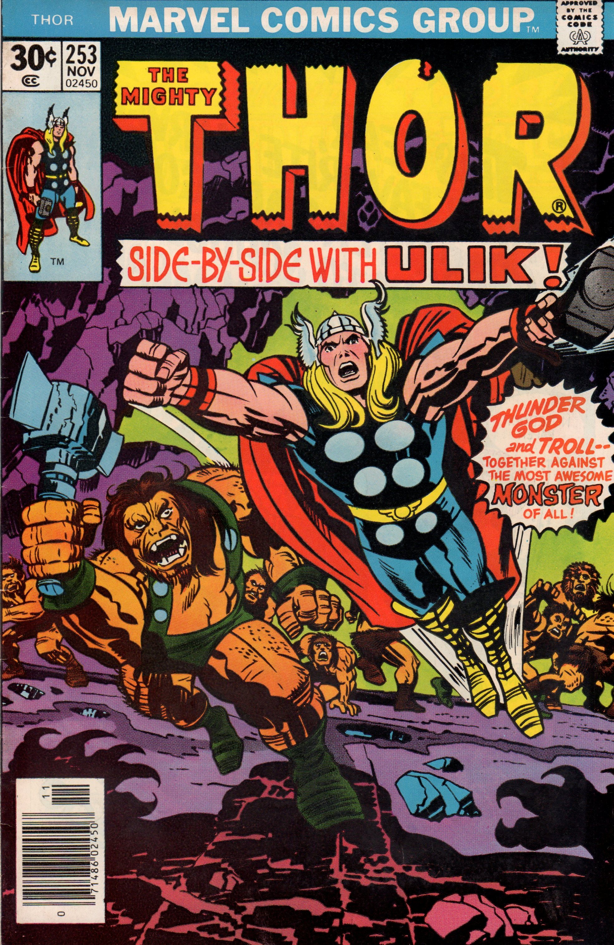
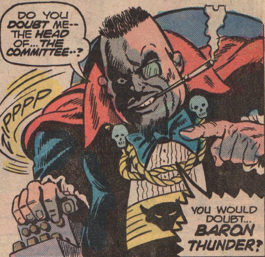
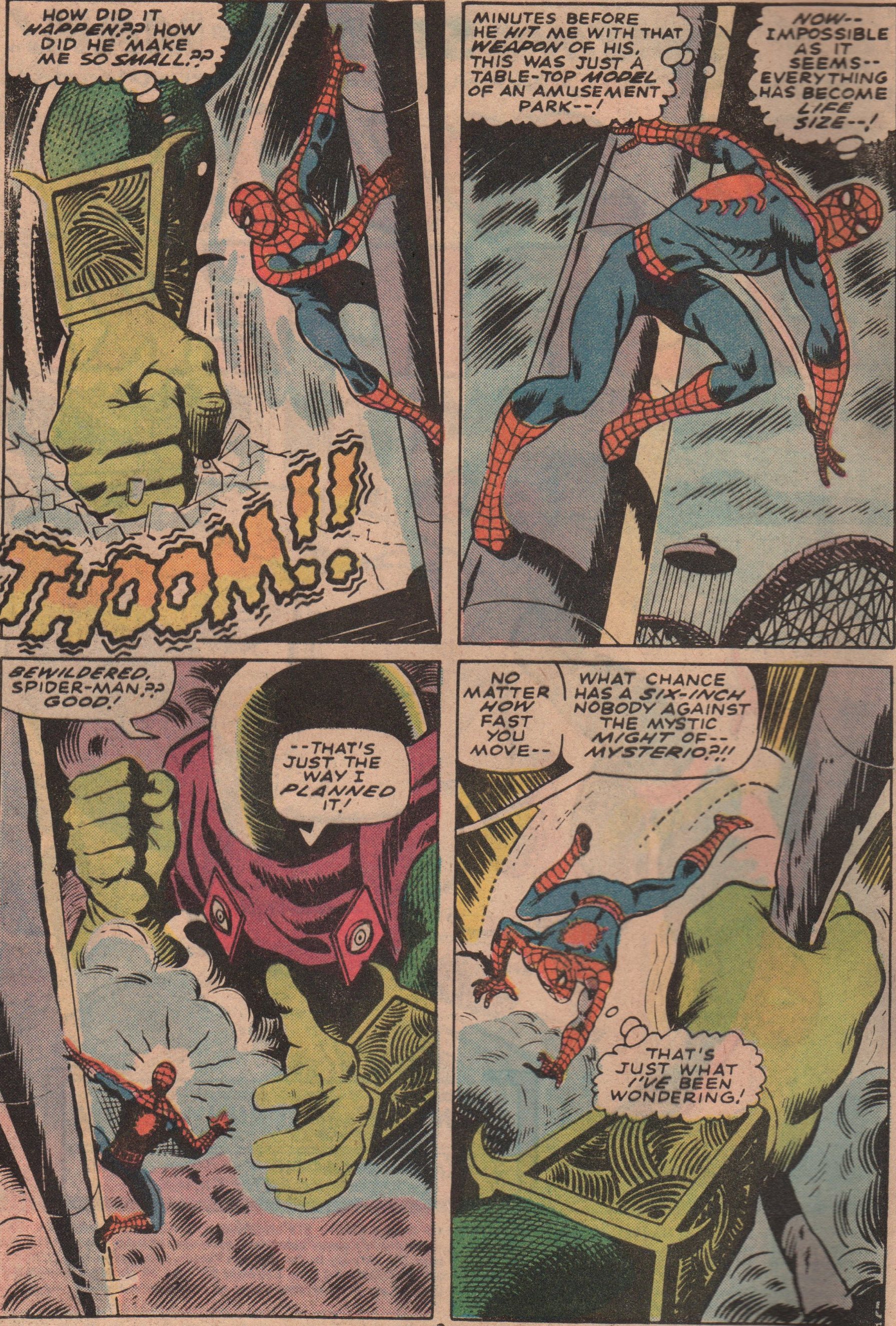
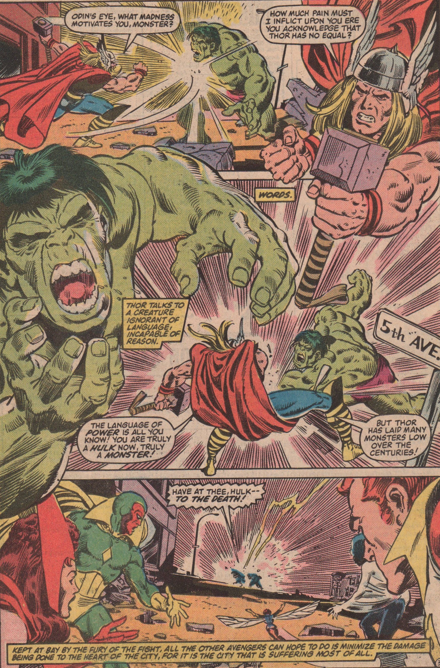
Thor 253, 1976 “Chaos in the Kingdom of the Trolls!”

Some of my favorite comics are those of Thor, volume one. Especially the issues in the mid-200s. I really enjoy the way each story seems self-contained but also connecting to the previous and following issues in a way that wasn’t inconvenient. In this second part of a three-part story, Tor must team-up with his sworn enemy, Ulik the Troll. These two absolutely hate one another, but they must work together to defeat a dragon and then a giant! By story’s end though, Ulik and his minions are laughing at the Prince of Asgard!

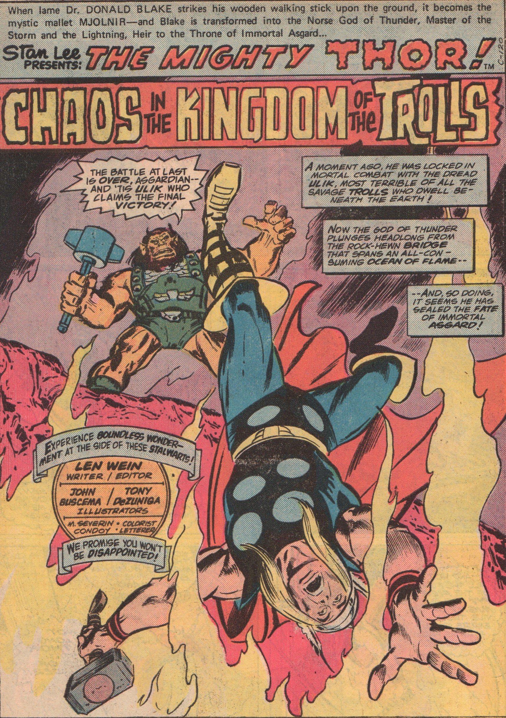
I’m a big fan of “Lively” Len Wein (writer/editor). From his work as an editor (Watchmen, New Teen Titans), and vision in reviving the X-Men franchise (along with Dave Cockrum), he really should be recognized a lot more than anyone seems to give him credit. Artist “Big” John Buscema (pencils), is a master that let us too soon. His work on books like Conan, The Avengers, and Silver Surfer are the stuff of legend. Of course, as with most artists, some inkers suited his style better than others, but honestly, his pencils were strong enough that they typically would show right through. One of the inkers that did suite him quite well, was Tony DeZuniga (Jonah Hex, Black Orchid). He’s another one of those guys that rarely gets enough airtime, as an inker or penciler, and that is a travesty. Colors were by the ever-present Marie Severin. She’s someone who should definitely be on your radar simply because not only was she a great artist, but also because she was one of the few women in comics since back in the Silver Age. Letters were by Condoy (?). The cover was by Jack “King” Kirby, and even though there appears to have been some alterations, you can still see the weight that Kirby’s pencils carry.


img596

img597

img598

img599

img601

img600


Doc Savage 8, 1973 “Werewolf’s Lair!”

Just for the record, I know virtually nothing about Doc Savage. That said, anytime you throw a classic monster in a comic book, I’m in! This wacky story reminds me of an episode of Johnny Quest (Werewolf of the Timberland) for several reasons. I wont get into them because it would spoil the issue, but you do get some good action, and some werewolf face-time as well. It’s part two of a story, so the circumstances leading up to this is lost on me, but that aside, it’s still very enjoyable. As the last issue in the series, you get the distinct impression it was cancelled abruptly because there’s no reference to cancellation at all.

As a whole, I like the work of Tony “The Tiger” Isabella (writer). He did some really cool horror stuff back in the early Bronze Age that’s worth looking up. The art team, led by “Riotous” Rich Buckler (cover pencils and interior layouts), are very solid. You get finishes and inks by “Terrific” Tom Palmer (Tomb of Dracula, The Avengers) and Jack Abel (GI Combat, Our Army at War) . Both men have had extensive careers in the industry, and proven themselves to be top-notch at their craft. Once again, the duo of “Titanic” Tom Orzechowski (letters) and “Genuine” George Roussos (colors), complete this list of comic book legends!


img586

img591

img592

img593

img594

img595

img587

Werewolf by Night #17, 1974 “The Behemoth!”

Everyone likes certain comics for a specific reason. The story, the artwork, the characters, and so on. Sometimes it’s as simple as a splash page, as is the case for me and this issue. I enjoy this title from beginning to end, no matter who the creative team happens to be on any particular issue. The work by Mike Ploog is obviously incredible, but by this time, he’d bowed out, and others took the reigns. Speaking of the reigns, in this particular issue, we see Jack and his handler/friend/lover, Topaz, as they’ve bitten off a bit more than they can chew with Baron Thunder! Not only is he the head of the secret group known only as “The Committee,” but he has a new ally on his side and completely under his command—The Behemoth!

Of course people have their favorites when it comes to creators, but I love a few characters so much, I can enjoy them almost all the time, no matter who is behind the steering wheel. It was only four issues long, but “Mischievous” Mike Friedrich (writer) kept the book moving forward. He’s one of those guys that gets lost among the giants of the era, but he certainly did a fine job. The artwork was by veteran “Dapper” Don Perlin (pencils and inks). I’ve always admired his work and when I look deep, I see a man who gave everything he had to an industry that didn’t always treat its creators fairly. Two more of my favorite creators in “Titanic” Tom Orzechowski (letters) and “Genuine” George Roussos (colors) round out the solid team that gave us this eerie read! A book needs a cover, and if you’re going to do it right, get Gil “Sugar” Kane and “Fearless” Frank Giacoia for the job!


img578

img579

img580

img581

img582

img583

img585


Fantasy Masterpieces #14, 1980 (originally SS #14, 1970) “The Surfer and The Spider!”

Getting two superheroes to fight is usually an interesting trope, but sometimes it does border on the ludicrous. This one lies somewhere in the middle, so fasten your seat-belt. Spidey and the Surfer haven’t had a lot of contact, so the times they do meet are kind of cool. The story really revolves around a boy that’s enthralled by comic books, and heroes such as these two. He gets a little too close to the action though, and winds up nearly being killed! Don’t worry, Spidey and the Surfer have enough time even with fighting to save the youth!

The glorious days of Marvel in the late Silver/early Bronze Age is undeniable. The work that Stan “The Man” Lee (writer) and “Big” John Buscema (pencils) put in on this title is awesome. Dan Adkins did a great job inking this story, and Sam Rosen with the letters as well.  The grandeur of the Silver Surfer was never on better display than in this series! Just an FYI: You also get an issue of Warlock (#11), that is also a fantastic read (Kudos to Jim Starlin, Steve Leialoha, and Tom Orzechowski)!


img557

img558

img559

img560

img561

img562

img563

Marvel Team-Up Annual #4, 1981 “Power Play!”

Every good comic book has several elements in it. A solid story is the first thing, and a great art team is a big boost, but you absolutely must have at least one comedic moment within the pages. When Spider-Man is involved, the writer has plenty of opportunities to make this happen. Throw in Power Man and Iron Fist, Daredevil, and Moon Knight, and the story has now the chances of being not only humorous, but also have pathos, and of course, altruism. Now, take all of those heroes, and add the nefarious Purple Man and the Kingpin of crime! Having these characters in the same book is all but a guarantee it will be good (it helps that the book is from a great era of comic books as well).

The name Frank Miller means different things to different people. Some immediately think of Daredevil (count me as one of them), some of The Dark Knight Returns. He’s done so much to transform the industry, I don’t think we’ll ever be able to appreciate fully the impact for years to come. He wrote this hilarious story (which shows he can do more than just gritty), and also penciled the cover, along with Josef Rubinstein on inks!  The interior art is by the team of Herb Trimpe (pencils) and Mike Esposito (inks). This was a very good team that is very rarely talked about, and that is a bit of a travesty. We see Diana Albers letters, and George Roussos on colors, as was the case with many books from this era (which gave an immense amount of consistency). Editing was none other than Tom Defalco (check out his work with Ron Frenz on Thor)!


img531

img532

img533

img534

img536

img537

img538

img539

img530

Marvel Tales #50, 1973 (Originally ASM #67, 1965) “To Squash A Spider!”

After recently purchasing this issue, I checked it out and knew I had to spotlight it for everyone to see! This story features a battle between Spidey and Mysterio! We now know that his forté is illusions, but back then, it wasn’t common knowledge. The story shows a miniature version of Spidey (six inches tall), having to fight his way through a fun house, all the while Mysterio is trying to kill him! There is some back matter as well. We see Joe Robertson having some issues with his son, and Gwen and her father, Captain Stacy. Great stuff, as the real world touches are what made Marvel tops!

For those that love to denounce Stan “The Man” Lee (writer), ponder this for a moment. While it seems as though he’s given himself too much credit in the actual creation of Marvel’s Silver Age explosion, I don’t think you can take away the consistency of his scripting, and his exuberance in the real “selling” of comic books. John “Ring-a-Ding” Romita (pencils) is one of the all-time greats of the industry. His romance work, inking, covers, and of course, his work on The Amazing Spider-Man are second to none. The inks (and finishes?) are by another familiar name from the Silver/Bronze Age in Jim “Madman” Mooney. Throw in good old Artie Simek (letters), and that rounds out this awesome team of creators!


img512

img513

img514

img515

img516

img519

img520

Marvel Two-in-One #87, 1982 “Menace of the Microworld!”

I figured with Ant-Man still on people’s minds, we could journey into the past, and check out an appearance of this eccentric character. Not only do you get him, but also the blue-eyed Thing! The Thing gets sucked into a Microverse, and it’s up to Ant-Man (with an assist by Reed Richards) to bring him back in one piece. But what if Ben doesn’t want to come back? Just think about it for a minute. What if Ben is whisked away to a world where he’s adored, and not feared? Would anyone want to come back to a world where you feel tormented?

This was a great phase of this title, when you had regular artists like “Rampaging” Ron Wilson (pencils) and “Cheerful” Chic Stone (inks) bringing you fantastic interior work. Still fairly young in his Marvel career (but not comics in general), Tom Defalco (writer) gives us a solid story that emphasizes what Ben Grimm is really all about. Colors are by Christie Scheele, letters by Rick Parker and Michael Higgins. The editor is one that was an absolute rock for Marvel throughout the years, Mr. Jim Salicrup!


img503

img504

img506

img507

img508

img509

img510

img511

The Incredible Hulk #300, 1984 “Days of Rage!”

The Hulk has had his ups and downs, as far as sales, and even in the overall quality of the work on the character over the years.  He’s an interesting character with the dual-identity, that gives authors many different angles with which to attack a story. In this anniversary issue, we see nothing but the monster, as Nightmare has forced Bruce Banner away, and nothing remains but the mindless beast! We all know that The Hulk is a bad mutha, and he gets tested by SHIELD, Power Man and Iron Fist, and even The Avengers! Thor manages to battle him to a standstill, but even he can’t put him away. The planet’s last hope is the Sorcerer Supreme, Dr. Strange!

The visual feast that this issue is, was brought to us by “Our Pal” Sal Buscema (pencils) and Gerry Talaoc (inker). Add on the colors by Bob Sharen, and you will read this book and think…”wow, they don’t make them like this anymore!” Seeing all these heroes battling an enraged monster is quite a delight. The the writer, Bill Mantlo, certainly needs no intro. His work is nothing short of legendary! Last but not least, we have Jim Novak on letters! (Cover by Brett Blevins!)

img475

img476

img478

img479

img480

img481

img482

img483

What If? #11, 1978 “The Original Marvel Bullpen Had Become The FF?”

I’ll admit, I really don’t care for “What If?” and you can dislike me for it. They can be fun, oh yes, but it just isn’t what I’m looking for in a comic book. That said, when you get a chance to grab an issue like this one, you cannot possibly pass it up! Seeing Lee and Kirby as Reed and the Thing, is enormous fun, and throw in Sol Brodsky as the Human Torch, and “Fabulous” Flo Steinberg as the Invisible Girl, and the book has to be a good one!

To see the pencils of Jack “King” Kirby, is nothing short of fascinating, no matter what the subject-matter. As the writer, penciler, and editor, he really went all in with this book, and gave us something special. The inks were by Mike Royer, and if you’ve seen their collaboration on DC comics “The Demon,” you know what they can do together. The letters were by Bill Wray and colors by Carl Gafford. If you get the chance, grab a copy if for nothing other than the Kirby artwork, it’s astonishing!


img436

img456

img457

img458

img459

img460

The Incredible Hulk Annual #6, 1977 “Beware The Beehive!”

This recent grab was…grabbed mostly for one reason- the appearance of Dr. Strange! Not that I don’t like the Hulk, I do, just more so in the pages of books like The Defenders, and The Avengers. I also love the “Beehive” and their insidious plots! In their second attempt at creating a god-like being, they unleash an even more powerful creature that initially tries to kill Dr. Strange! The old Doc has a difficult time with the man-made entity, but the Jade Giant is on his way to smash!

With a plot by editor, Len Wein, David Anthony Kraft (writer) gives us a story that is fairly simplistic but also solid in its delivery. No frills, just a slight mystery followed by straight up action! The art work by Herb Trimpe (pencils, the interiors and cover), Frank Giacoia (inks) and Mike Esposito (inks), give the reader a less rigid look than you typically get from Trimpe pencils (he usually has a more block-style, a la Kirby), and the inkers get credit for that, no doubt about it. Colors by Janice Cohen, and letters by Gaspar, round out the team!


img439

img445

img446

img447

img448

img449

img450