Thor 253, 1976 “Chaos in the Kingdom of the Trolls!”

Some of my favorite comics are those of Thor, volume one. Especially the issues in the mid-200s. I really enjoy the way each story seems self-contained but also connecting to the previous and following issues in a way that wasn’t inconvenient. In this second part of a three-part story, Tor must team-up with his sworn enemy, Ulik the Troll. These two absolutely hate one another, but they must work together to defeat a dragon and then a giant! By story’s end though, Ulik and his minions are laughing at the Prince of Asgard!

I’m a big fan of “Lively” Len Wein (writer/editor). From his work as an editor (Watchmen, New Teen Titans), and vision in reviving the X-Men franchise (along with Dave Cockrum), he really should be recognized a lot more than anyone seems to give him credit. Artist “Big” John Buscema (pencils), is a master that let us too soon. His work on books like Conan, The Avengers, and Silver Surfer are the stuff of legend. Of course, as with most artists, some inkers suited his style better than others, but honestly, his pencils were strong enough that they typically would show right through. One of the inkers that did suite him quite well, was Tony DeZuniga (Jonah Hex, Black Orchid). He’s another one of those guys that rarely gets enough airtime, as an inker or penciler, and that is a travesty. Colors were by the ever-present Marie Severin. She’s someone who should definitely be on your radar simply because not only was she a great artist, but also because she was one of the few women in comics since back in the Silver Age. Letters were by Condoy (?). The cover was by Jack “King” Kirby, and even though there appears to have been some alterations, you can still see the weight that Kirby’s pencils carry.


img596

img597

img598

img599

img601

img600


Doc Savage 8, 1973 “Werewolf’s Lair!”

Just for the record, I know virtually nothing about Doc Savage. That said, anytime you throw a classic monster in a comic book, I’m in! This wacky story reminds me of an episode of Johnny Quest (Werewolf of the Timberland) for several reasons. I wont get into them because it would spoil the issue, but you do get some good action, and some werewolf face-time as well. It’s part two of a story, so the circumstances leading up to this is lost on me, but that aside, it’s still very enjoyable. As the last issue in the series, you get the distinct impression it was cancelled abruptly because there’s no reference to cancellation at all.

As a whole, I like the work of Tony “The Tiger” Isabella (writer). He did some really cool horror stuff back in the early Bronze Age that’s worth looking up. The art team, led by “Riotous” Rich Buckler (cover pencils and interior layouts), are very solid. You get finishes and inks by “Terrific” Tom Palmer (Tomb of Dracula, The Avengers) and Jack Abel (GI Combat, Our Army at War) . Both men have had extensive careers in the industry, and proven themselves to be top-notch at their craft. Once again, the duo of “Titanic” Tom Orzechowski (letters) and “Genuine” George Roussos (colors), complete this list of comic book legends!


img586

img591

img592

img593

img594

img595

img587

Werewolf by Night #17, 1974 “The Behemoth!”

Everyone likes certain comics for a specific reason. The story, the artwork, the characters, and so on. Sometimes it’s as simple as a splash page, as is the case for me and this issue. I enjoy this title from beginning to end, no matter who the creative team happens to be on any particular issue. The work by Mike Ploog is obviously incredible, but by this time, he’d bowed out, and others took the reigns. Speaking of the reigns, in this particular issue, we see Jack and his handler/friend/lover, Topaz, as they’ve bitten off a bit more than they can chew with Baron Thunder! Not only is he the head of the secret group known only as “The Committee,” but he has a new ally on his side and completely under his command—The Behemoth!

Of course people have their favorites when it comes to creators, but I love a few characters so much, I can enjoy them almost all the time, no matter who is behind the steering wheel. It was only four issues long, but “Mischievous” Mike Friedrich (writer) kept the book moving forward. He’s one of those guys that gets lost among the giants of the era, but he certainly did a fine job. The artwork was by veteran “Dapper” Don Perlin (pencils and inks). I’ve always admired his work and when I look deep, I see a man who gave everything he had to an industry that didn’t always treat its creators fairly. Two more of my favorite creators in “Titanic” Tom Orzechowski (letters) and “Genuine” George Roussos (colors) round out the solid team that gave us this eerie read! A book needs a cover, and if you’re going to do it right, get Gil “Sugar” Kane and “Fearless” Frank Giacoia for the job!


img578

img579

img580

img581

img582

img583

img585


Fantasy Masterpieces #14, 1980 (originally SS #14, 1970) “The Surfer and The Spider!”

Getting two superheroes to fight is usually an interesting trope, but sometimes it does border on the ludicrous. This one lies somewhere in the middle, so fasten your seat-belt. Spidey and the Surfer haven’t had a lot of contact, so the times they do meet are kind of cool. The story really revolves around a boy that’s enthralled by comic books, and heroes such as these two. He gets a little too close to the action though, and winds up nearly being killed! Don’t worry, Spidey and the Surfer have enough time even with fighting to save the youth!

The glorious days of Marvel in the late Silver/early Bronze Age is undeniable. The work that Stan “The Man” Lee (writer) and “Big” John Buscema (pencils) put in on this title is awesome. Dan Adkins did a great job inking this story, and Sam Rosen with the letters as well.  The grandeur of the Silver Surfer was never on better display than in this series! Just an FYI: You also get an issue of Warlock (#11), that is also a fantastic read (Kudos to Jim Starlin, Steve Leialoha, and Tom Orzechowski)!


img557

img558

img559

img560

img561

img562

img563

Marvel Tales #50, 1973 (Originally ASM #67, 1965) “To Squash A Spider!”

After recently purchasing this issue, I checked it out and knew I had to spotlight it for everyone to see! This story features a battle between Spidey and Mysterio! We now know that his forté is illusions, but back then, it wasn’t common knowledge. The story shows a miniature version of Spidey (six inches tall), having to fight his way through a fun house, all the while Mysterio is trying to kill him! There is some back matter as well. We see Joe Robertson having some issues with his son, and Gwen and her father, Captain Stacy. Great stuff, as the real world touches are what made Marvel tops!

For those that love to denounce Stan “The Man” Lee (writer), ponder this for a moment. While it seems as though he’s given himself too much credit in the actual creation of Marvel’s Silver Age explosion, I don’t think you can take away the consistency of his scripting, and his exuberance in the real “selling” of comic books. John “Ring-a-Ding” Romita (pencils) is one of the all-time greats of the industry. His romance work, inking, covers, and of course, his work on The Amazing Spider-Man are second to none. The inks (and finishes?) are by another familiar name from the Silver/Bronze Age in Jim “Madman” Mooney. Throw in good old Artie Simek (letters), and that rounds out this awesome team of creators!
 

img512

img513

img514

img515

img516

img519

img520

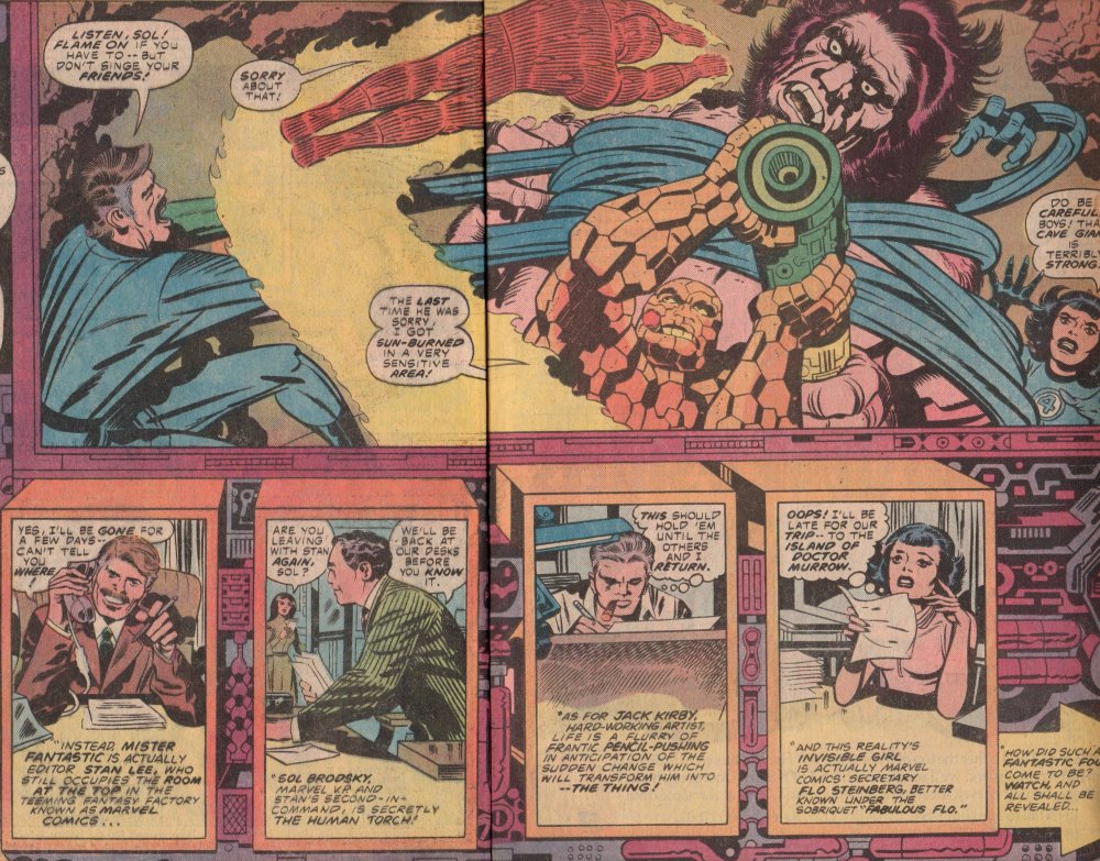
What If? #11, 1978 “The Original Marvel Bullpen Had Become The FF?”

I’ll admit, I really don’t care for “What If?” and you can dislike me for it. They can be fun, oh yes, but it just isn’t what I’m looking for in a comic book. That said, when you get a chance to grab an issue like this one, you cannot possibly pass it up! Seeing Lee and Kirby as Reed and the Thing, is enormous fun, and throw in Sol Brodsky as the Human Torch, and “Fabulous” Flo Steinberg as the Invisible Girl, and the book has to be a good one!

To see the pencils of Jack “King” Kirby, is nothing short of fascinating, no matter what the subject-matter. As the writer, penciler, and editor, he really went all in with this book, and gave us something special. The inks were by Mike Royer, and if you’ve seen their collaboration on DC comics “The Demon,” you know what they can do together. The letters were by Bill Wray and colors by Carl Gafford. If you get the chance, grab a copy if for nothing other than the Kirby artwork, it’s astonishing!


img436

img456

img457

img458

img459

img460

The Incredible Hulk Annual #6, 1977 “Beware The Beehive!”

This recent grab was…grabbed mostly for one reason- the appearance of Dr. Strange! Not that I don’t like the Hulk, I do, just more so in the pages of books like The Defenders, and The Avengers. I also love the “Beehive” and their insidious plots! In their second attempt at creating a god-like being, they unleash an even more powerful creature that initially tries to kill Dr. Strange! The old Doc has a difficult time with the man-made entity, but the Jade Giant is on his way to smash!

With a plot by editor, Len Wein, David Anthony Kraft (writer) gives us a story that is fairly simplistic but also solid in its delivery. No frills, just a slight mystery followed by straight up action! The art work by Herb Trimpe (pencils, the interiors and cover), Frank Giacoia (inks) and Mike Esposito (inks), give the reader a less rigid look than you typically get from Trimpe pencils (he usually has a more block-style, a la Kirby), and the inkers get credit for that, no doubt about it. Colors by Janice Cohen, and letters by Gaspar, round out the team!


img439

img445

img446

img447

img448

img449

img450

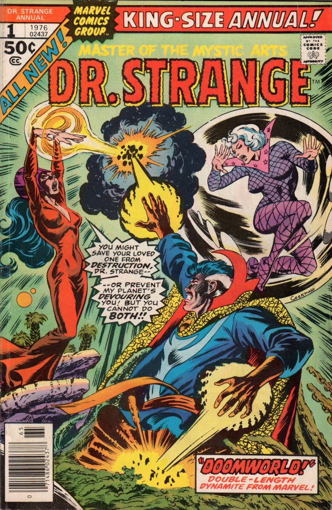
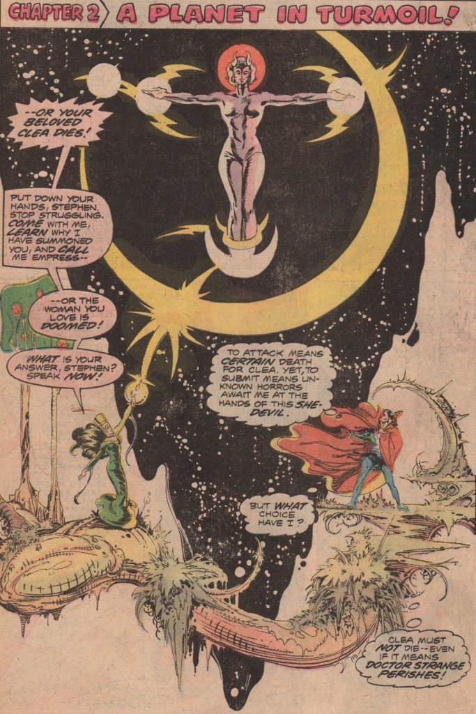
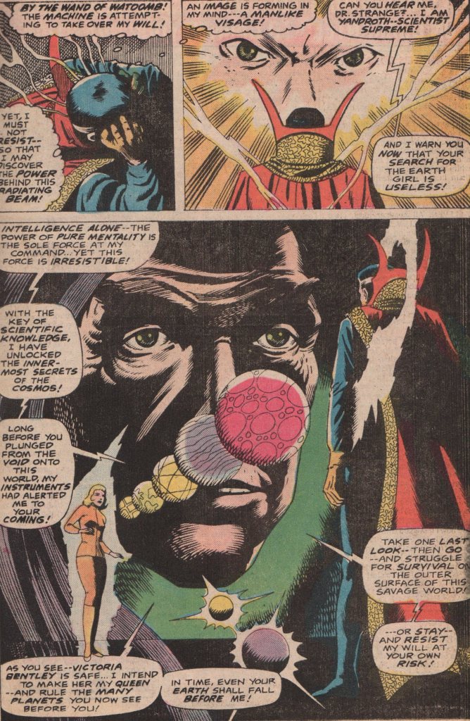
Dr. Strange Annual #1, 1976 “…and there will be worlds anew!”

There are many creators that made their mark in the Bronze Age, and some that ascended from an embryonic stage to stardom. Of course, these men and women didn’t realize it back in the day, but decades later, others like myself revel in their works, and hold them in high esteem for it! A title that most certainly gave opportunity for those willing to work on it was Dr. Strange! Think about it. Limitless worlds, characters, scenarios, etc., that was a springboard for the imaginations of its creators that had the wherewithal to use.

One of those above mentioned creators without a doubt, is P. Craig Russell (co-plotter, pencils, inks, colors)! This man’s work is nothing short of extraordinary to say the least. His run on Amazing Adventures is the stuff of legend. His inks over the pencils of Gil Kane (Marvel Fanfare) are noteworthy as well. As with many books of that era, Marv Wolfman (script and co-plot) lent his tremendous skills as a writer, and joined Russell in creating a gem. Letters by John Costanza, and a fantastic cover by none other than Dave Cockrum!


img429

img430

img431

img432

img433

img434

img435

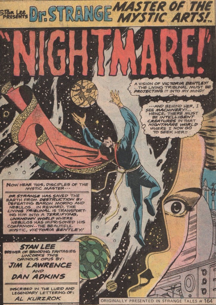
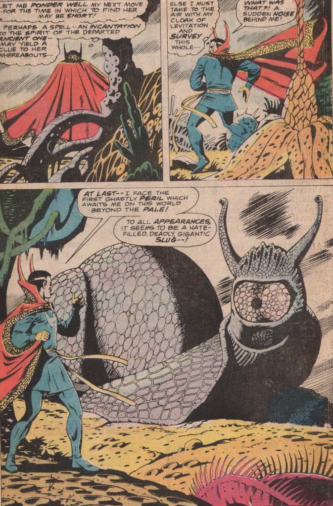
Giant-Size Dr. Strange #1, 1975 “This Dream…This Doom!”

For some, reprints are of no interest. But, for those without deep pockets or a life expectancy of 175, they are a welcomed addition to a collection. One example for sure, is the work on Strange Tales by Steve Ditko. Those issues are tough to find intact at a decent price. Thanks to Marvel’s Essentials, though, I solved that problem. After Ditko left the title (and Marvel), there was a cavalcade of creators thrown on the title. Not a lack of effort or good content, just not a lot of continuity throughout. The one and only annual for the series (the 1974 series), was a bunch of reprints from the era just after Ditko left the book. You do get some cool stories of the Doc fighting monsters, a mad scientist, and his killer robot!

The issues in this annual are mostly written by Jim Lawrence (script on all but the last), a man I know very little about, to be honest. After searching his name, I saw that he did some James Bond strips, and a few things for Marvel in the 1970’s. Not bad scripts, but not up to the standard set forth by the other headliners of the times. Dan Adkins (pencils, inks on one chapter, and plots) gave us some solid pencils, and inked one issue that George Tuska filled in for him as well. The last two stories were written by Denny O’Neil, and we all know about his writing chops (Batman, Green Lantern/Green Arrow, Amazing Spider-Man, etc.)! As if all these names were not enough, you still get that awesome cover by none other than Gil Kane!


img403

img404

img405

img406

img410

img411

img412

img413

Conan the Barbarian #41, 1974 “Garden of Death and Life!”

Of course, who doesn’t enjoy a good story where Conan thrashes some scoundrels, and then saves the beautiful woman! I know a lot of people will steer clear of a series like this because they think it’s very one-trick pony, but if you really enjoy the genre, give it a try! This story in particular has a very weird and twisting ending. Sometimes Conan can get a little weary in regards to the plot, but action is never missing nor is a mystical/magical aspect that always kept my interest. Throw in an evil sorcerer or a weird creature, and I’m in for the long run!

When you have a character with the history that Conan has, it’s now extremely difficult to cook up decent stories. That’s not to take anything away from Roy Thomas (writer) mind you, but the groundwork laid by Robert E. Howard (creator) surely deserves the lion-share of the credit. It certainly doesn’t hurt your book when you have an artist the caliber of “Big” John Buscema (pencils, R.I.P.) and Ernie Chan (inker on interiors and cover) to put forth a spectacular visual feast either! Add on Bronze Age stalwarts John Costanza (letters), and Glynis Wein (colors), and the book will ascend to the heights of greatness! Did I forget to mention the cover by the master, Gil Kane?


img393

img394

img395

img396

img397

img401