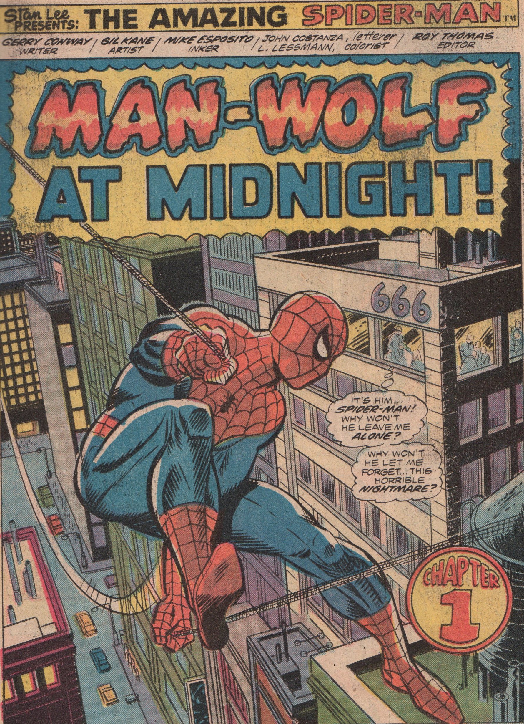
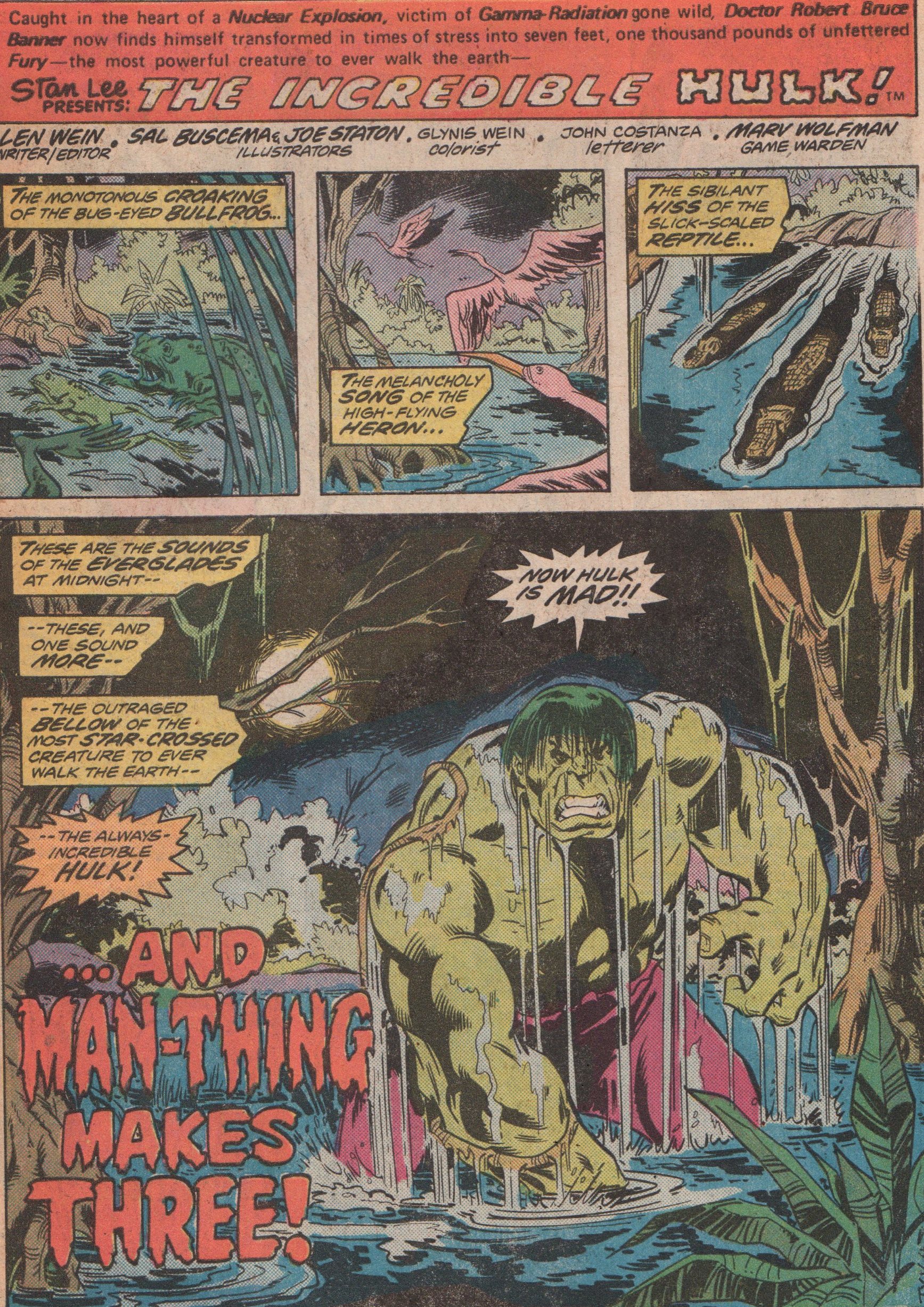
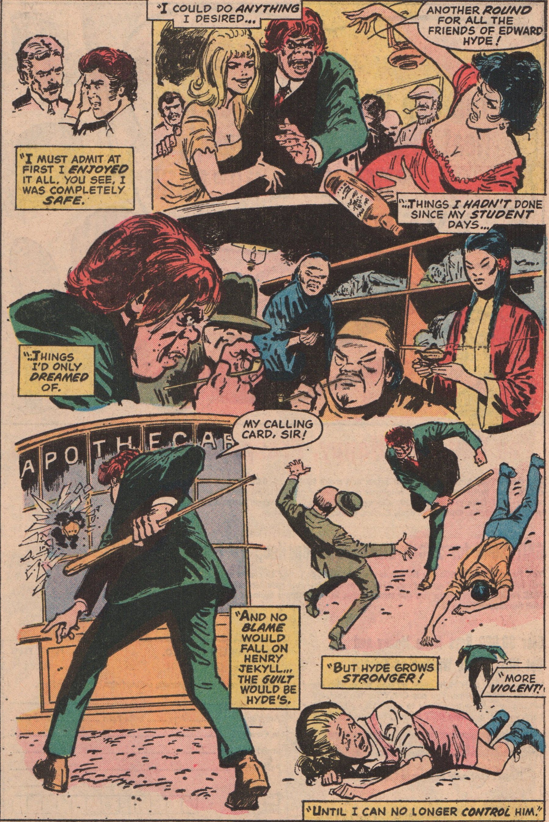
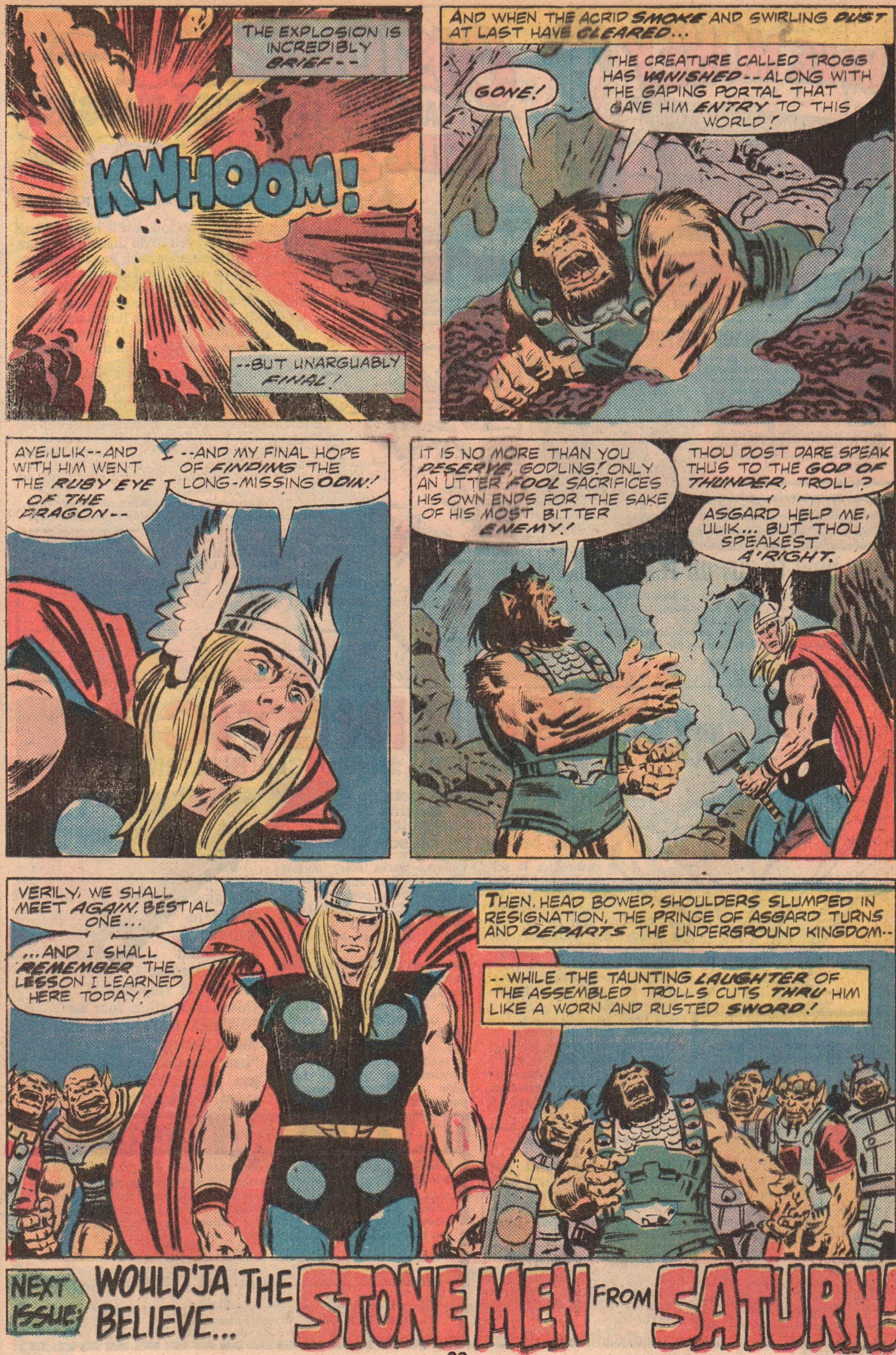
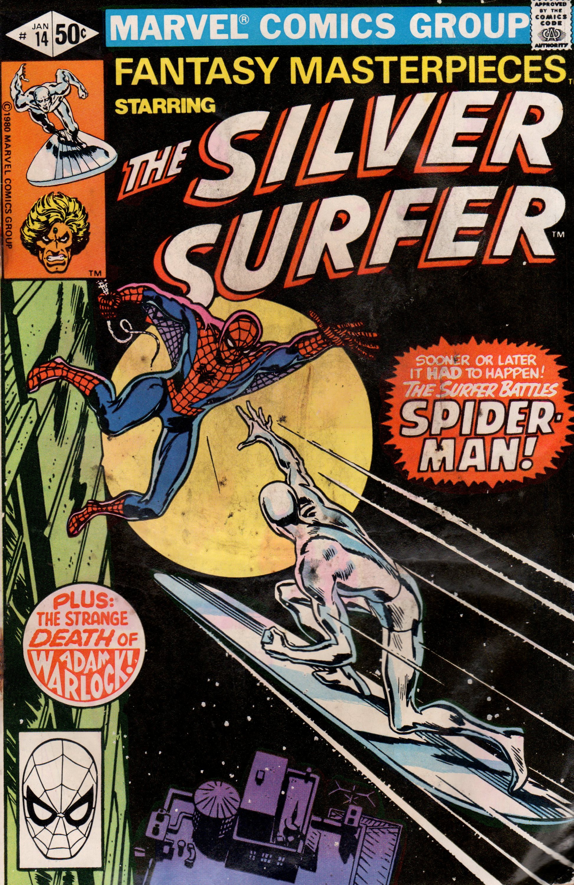
Giant-Size Super-Heroes 1, 1974 “Man-Wolf at Midnight!”

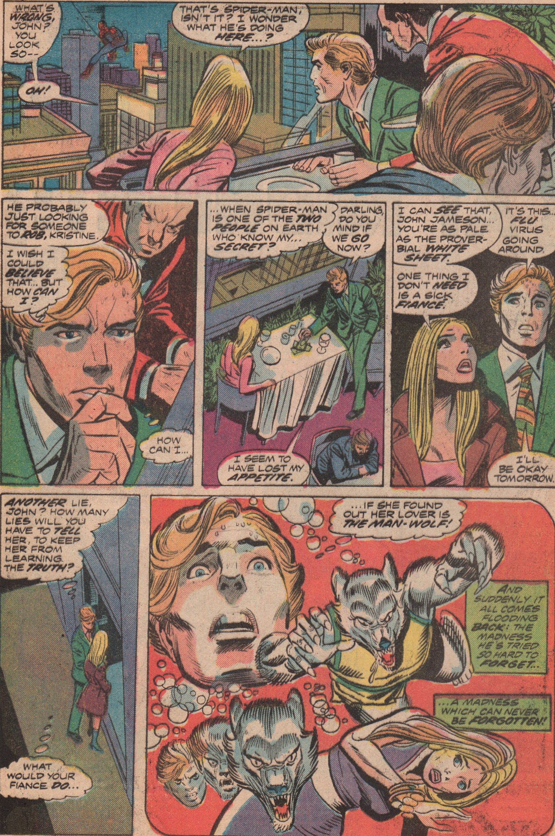
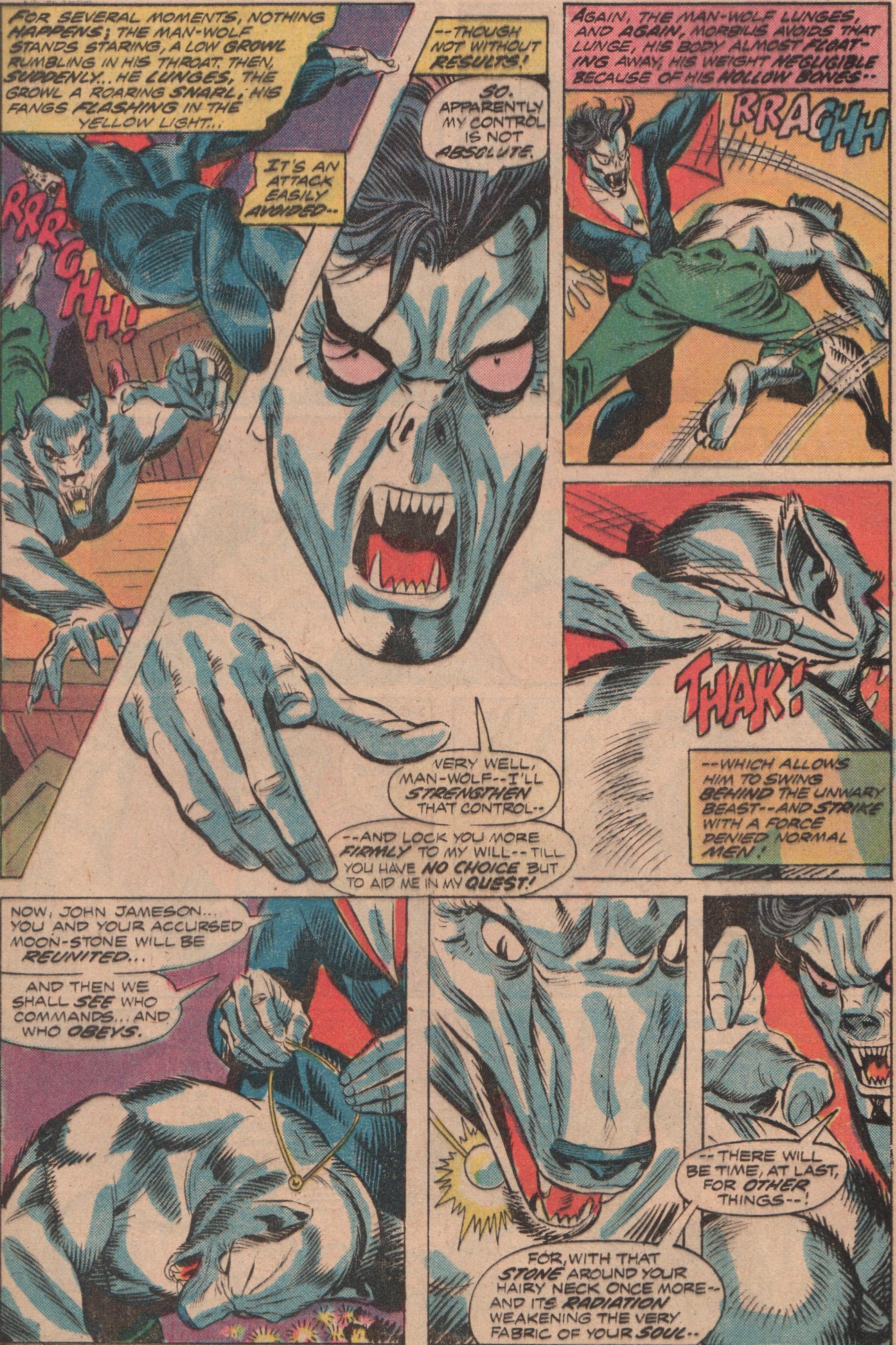
Right smack in the middle of the horror explosion of the 1970’s, Marvel began to more regularly put its macabre characters into the mainstream superhero books as well.  Of course, there are good points and bad points about saturating books with certain characters, but I’ve always come down on the side of enjoying it. Honestly, how can you not like a book that pits Spidey against Man-Wolf and Morbius? You don’t get much of the classic conflict with Morbius in this issue (his original problem of not wanting to be a monster, you know a tortured soul type). We do however get that with John Jameson, as he’s been recovering from his bout with Spidey and his inner conflict.

At this point, Gerry Conway (writer) was firing on all cylinders. Whether it was Spidey or any other book, he was consistently churning out good scripts for Marvel and DC comics during the Bronze Age. There aren’t many art teams that can supersede Gil Kane (pencils) and Mike Esposito (inks).  These two creators worked great together, and you can really see their willingness to put forth their very best efforts. John Costanza (letters), Linda Lessmann (colors), and Roy Thomas (editor) round out the creative team (John Romita inking the Gil Kane pencils on the cover)!


img676

img677

img678

img679

img680

img681

img682

The Incredible Hulk 197, 1976 “…And Man-Thing Makes Three!”

Since October is now upon us, my blog will feature nothing but horror comics. Although it does feature this genre often, I couldn’t wait for this month to come because I love horror comics! Honestly, I love comics period, but even when a horror character makes an appearance in a superhero book I love it! This is the case with this book, as the Incredible Hulk must fight not one but two horror characters that actually prove that not only can the Hulk be beaten, but knocked completely unconscious! And you know when the Collector is involved, things will get cosmic!

I usually don’t start talking about the creative team by mentioning the cover. Not because I’m a heel or anything, but typically, an issue overall offers more from the inside. There’s no way possible for me to not start with “Bashful” Bernie Wrightson (cover art). He didn’t do that much work for Marvel Comics, but, wow, this one is amazing! When you open this book, you’ll quickly learn why I love the writing of “Lively” Len Wein. No matter who the characters, or the setting, scenario, etc., the guy delivers a solid story/script. When you also then get an interior art team like “Our Pal” Sal Buscema (pencils) and Joe Staton (inks), it’s quite a treat. Glynis Wein (colors) and John Costanza (letters) add their talents to this great book, that was edited by “Marvelous” Marv Wolfman!


img669

img670

img671

img672

img673

img674

img675

Giant-Size Man-Thing 2, 1974 “Of Monsters and Men!”

How is it possible that a character that cannot speak be so appealing? Well, when you take an origin story that involves a mystical swamp (near the Nexus of All Realities), a scientist, and Hydra (a later retcon not explicitly told in the origin story), and you’ve got a great way to convince me. Taking the concept from King Kong (1933), men who seek to cage something unnatural, and put it on display, are just begging for trouble. The trope of trying to contain something that is virtually uncontrollable, is one that’s been used many times over, with a varying degree of success. This time is definitely on the positive side.

When he was still alive, the mind of Steve “Baby” Gerber (writer) might have been a scary place to dive into. Hi stories about the weird and supernatural are top-notch. Why he isn’t recognized more outside of the circle of hardcore fans is a mystery to me, especially considering the praise other creators from that era and beyond seem to have for him and his work. Of Out of all the people who’ve drawn Man-Thing, I think “Big” John Buscema (pencils on interiors, and cover art) is my favorite. He certainly understood how to draw everything  even though he’s gone on record stating he didn’t like to draw superheroes all that much, he always did an admirable job. He is still one of the giants of the industry. “Santa” Klaus Janson (inks) is an artist that I first saw on Daredevil, and always thought he brought an extra dimension to whatever he had his hands in. John Costanza (letters) and Linda Lessmann (colors), are two very capable contributors that never failed to get it done. Let us not forget “Rascally” Roy Thomas (editor), as his work not only as a writer, but editing also is something that puts him at the top of the food chain in comic book history! You also get three bonus stories with work by great creators like Dick Ayers, Don Heck, and Jack Kirby!


img644

img645

img646

img647

img648

img649

img650

img651

img652

Supernatural Thrillers 4, 1973 “Dr. Jekyll and Mr. Hyde”

The title “Supernatural Thrillers” is probably most known for the Living Mummy character, but its beginnings were quite different. The first four issues contained stories based off of classic monsters! This one in particular is an adaptation of the classic story by Robert Lois Stevenson, Dr. Jekyll and Mr. Hyde! The story revolves around a certain doctor that is having a crisis of conscience. He believes that his scientific endeavors trump any sort of morality. Hammer Studios did a movie adaptation that was marvelous, so definitely check that out!

The team of creators on this book are foreign to me (with the exception of the artist) for the most part. The writer, Ron Goulart, is most known for his mystery and sci-fi work. The interior artwork is by Golden Age DC artist, Win Mortimer (Superman, Superboy). He was instrumental in that era’s consistency, and along with others like Bill Finger, Jerry Robinson, Joe Kubert, and more. Letters were by Jean Izzo and editing was Roy Thomas! The cover was by “Rampaging” Ron Wilson and Ernie Chan!


img631

img632

img633

img634

img635

img636

Worlds Unknown 7 and 8, 1974 “The Golden Voyage of Sinbad”

Being a huge fan of Ray Harryhausen, I’m always delighted to see a comic book that was influenced by work of his. Well, there were at least books I know of that were straight up adaptations of his stop-motion work. One is Marvel Spotlight 25, and the other two are Worlds Unknown 7 & 8! Both of these comics showcase a film “The Golden Voyage of Sinbad,” condensed, of course. We see Sinbad and his crew battle mythical monsters, evil sorcerers, and the like!

Len Wein (writer) is a guy who’s probably most known for being a part of resurrecting the X-Men franchise, and rightly so, but if you look at the entire body of work, he deserves much more credit. It doesn’t take a writing wizard to adapt a movie into a comic book, Ill give you that, but seeing his name in the credits of any book puts my mind at ease. The art team of George Tuska (interior pencils and cover pencils to issue 7) and Vince Colletta (inks- interiors and covers) is one that some might malign. I understand when people complain about Colletta rushing jobs and putting out substandard work. He has done some good work though, and I think issues like these two prove it. Glynis Wein (colors) and John Costanza (letters) both were always very solid and deserve kudos. On issue number eight, we get a cover by one of the masters of the comic book industry, Gil Kane!


img615

img616

img617

img618

img619

img620

img621

Ghost Rider 42, 1980 “The Lonesome Death of Johnny Blaze”

I’ve read a couple of good chunks of Ghost Rider (volume one), and a scant few issues of the other series throughout the years. Nothing resonates with me except the earlier stuff with Johnny Blaze. Why? I don’t know, but I can tell you that the earlier work not only dealt with the horror genre but also the biker gang phase of culture in the 1970’s as well. It may be the mystery that was so exhilarating, coupled with the horror angle, but whatever it was, it sticks with you. The very early work was tied in with Daimon Hellstrom (the Son of Satan), which also added a really cool vibe to the character. This issue (I showcased the previous one here) has Johnny still an amnesiac, and fawning over a girl named Gina. There usually was a girl who would pop up now and again, to try the romance angle, but most of them were flat compared to Roxanne Simpson.

The name Michael Fleisher (writer) isn’t one that is tossed around everyday. He had a pretty good run on this title ( as well as Conan, House of Mystery, and House of Secrets), but mostly fill-ins and such. Don Perlin (pencils and inks) is a man who I admire. Another name that’s usually lost among the titans, but one that everyone should know. Anyone that frequents my blog knows him name though! Diana Albers (letters) and Ben Sean (colors), round out the creative team. Not to be forgotten are the two Bob’s! Bob Budiansky (pencils) and Bob Wiacek (inks) gave us this cool cover!


img605

img606

img608

img609

img610

img611

Thor 253, 1976 “Chaos in the Kingdom of the Trolls!”

Some of my favorite comics are those of Thor, volume one. Especially the issues in the mid-200s. I really enjoy the way each story seems self-contained but also connecting to the previous and following issues in a way that wasn’t inconvenient. In this second part of a three-part story, Tor must team-up with his sworn enemy, Ulik the Troll. These two absolutely hate one another, but they must work together to defeat a dragon and then a giant! By story’s end though, Ulik and his minions are laughing at the Prince of Asgard!

I’m a big fan of “Lively” Len Wein (writer/editor). From his work as an editor (Watchmen, New Teen Titans), and vision in reviving the X-Men franchise (along with Dave Cockrum), he really should be recognized a lot more than anyone seems to give him credit. Artist “Big” John Buscema (pencils), is a master that let us too soon. His work on books like Conan, The Avengers, and Silver Surfer are the stuff of legend. Of course, as with most artists, some inkers suited his style better than others, but honestly, his pencils were strong enough that they typically would show right through. One of the inkers that did suite him quite well, was Tony DeZuniga (Jonah Hex, Black Orchid). He’s another one of those guys that rarely gets enough airtime, as an inker or penciler, and that is a travesty. Colors were by the ever-present Marie Severin. She’s someone who should definitely be on your radar simply because not only was she a great artist, but also because she was one of the few women in comics since back in the Silver Age. Letters were by Condoy (?). The cover was by Jack “King” Kirby, and even though there appears to have been some alterations, you can still see the weight that Kirby’s pencils carry.


img596

img597

img598

img599

img601

img600


Doc Savage 8, 1973 “Werewolf’s Lair!”

Just for the record, I know virtually nothing about Doc Savage. That said, anytime you throw a classic monster in a comic book, I’m in! This wacky story reminds me of an episode of Johnny Quest (Werewolf of the Timberland) for several reasons. I wont get into them because it would spoil the issue, but you do get some good action, and some werewolf face-time as well. It’s part two of a story, so the circumstances leading up to this is lost on me, but that aside, it’s still very enjoyable. As the last issue in the series, you get the distinct impression it was cancelled abruptly because there’s no reference to cancellation at all.

As a whole, I like the work of Tony “The Tiger” Isabella (writer). He did some really cool horror stuff back in the early Bronze Age that’s worth looking up. The art team, led by “Riotous” Rich Buckler (cover pencils and interior layouts), are very solid. You get finishes and inks by “Terrific” Tom Palmer (Tomb of Dracula, The Avengers) and Jack Abel (GI Combat, Our Army at War) . Both men have had extensive careers in the industry, and proven themselves to be top-notch at their craft. Once again, the duo of “Titanic” Tom Orzechowski (letters) and “Genuine” George Roussos (colors), complete this list of comic book legends!


img586

img591

img592

img593

img594

img595

img587

Werewolf by Night #17, 1974 “The Behemoth!”

Everyone likes certain comics for a specific reason. The story, the artwork, the characters, and so on. Sometimes it’s as simple as a splash page, as is the case for me and this issue. I enjoy this title from beginning to end, no matter who the creative team happens to be on any particular issue. The work by Mike Ploog is obviously incredible, but by this time, he’d bowed out, and others took the reigns. Speaking of the reigns, in this particular issue, we see Jack and his handler/friend/lover, Topaz, as they’ve bitten off a bit more than they can chew with Baron Thunder! Not only is he the head of the secret group known only as “The Committee,” but he has a new ally on his side and completely under his command—The Behemoth!

Of course people have their favorites when it comes to creators, but I love a few characters so much, I can enjoy them almost all the time, no matter who is behind the steering wheel. It was only four issues long, but “Mischievous” Mike Friedrich (writer) kept the book moving forward. He’s one of those guys that gets lost among the giants of the era, but he certainly did a fine job. The artwork was by veteran “Dapper” Don Perlin (pencils and inks). I’ve always admired his work and when I look deep, I see a man who gave everything he had to an industry that didn’t always treat its creators fairly. Two more of my favorite creators in “Titanic” Tom Orzechowski (letters) and “Genuine” George Roussos (colors) round out the solid team that gave us this eerie read! A book needs a cover, and if you’re going to do it right, get Gil “Sugar” Kane and “Fearless” Frank Giacoia for the job!


img578

img579

img580

img581

img582

img583

img585


Fantasy Masterpieces #14, 1980 (originally SS #14, 1970) “The Surfer and The Spider!”

Getting two superheroes to fight is usually an interesting trope, but sometimes it does border on the ludicrous. This one lies somewhere in the middle, so fasten your seat-belt. Spidey and the Surfer haven’t had a lot of contact, so the times they do meet are kind of cool. The story really revolves around a boy that’s enthralled by comic books, and heroes such as these two. He gets a little too close to the action though, and winds up nearly being killed! Don’t worry, Spidey and the Surfer have enough time even with fighting to save the youth!

The glorious days of Marvel in the late Silver/early Bronze Age is undeniable. The work that Stan “The Man” Lee (writer) and “Big” John Buscema (pencils) put in on this title is awesome. Dan Adkins did a great job inking this story, and Sam Rosen with the letters as well.  The grandeur of the Silver Surfer was never on better display than in this series! Just an FYI: You also get an issue of Warlock (#11), that is also a fantastic read (Kudos to Jim Starlin, Steve Leialoha, and Tom Orzechowski)!


img557

img558

img559

img560

img561

img562

img563