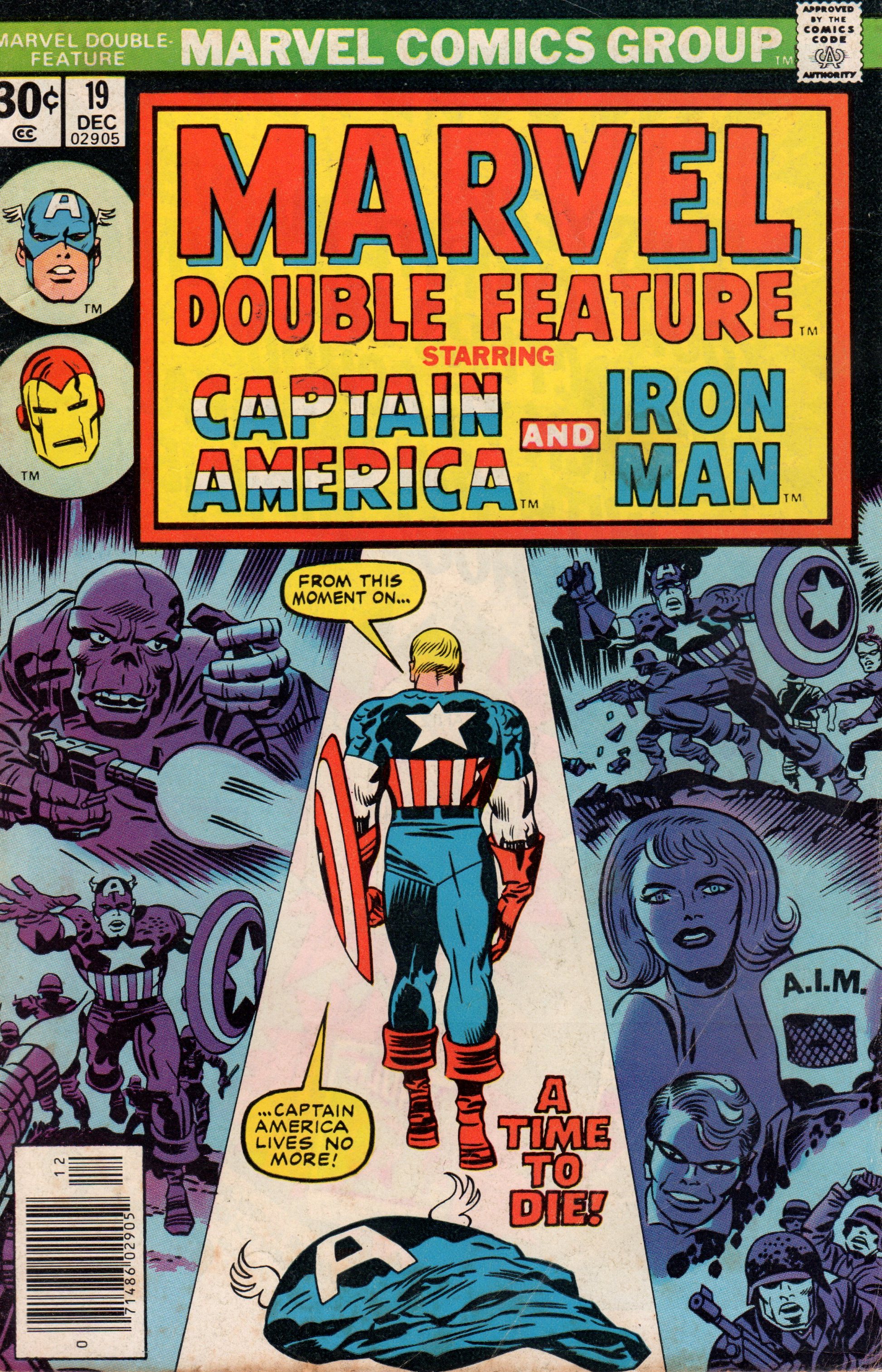
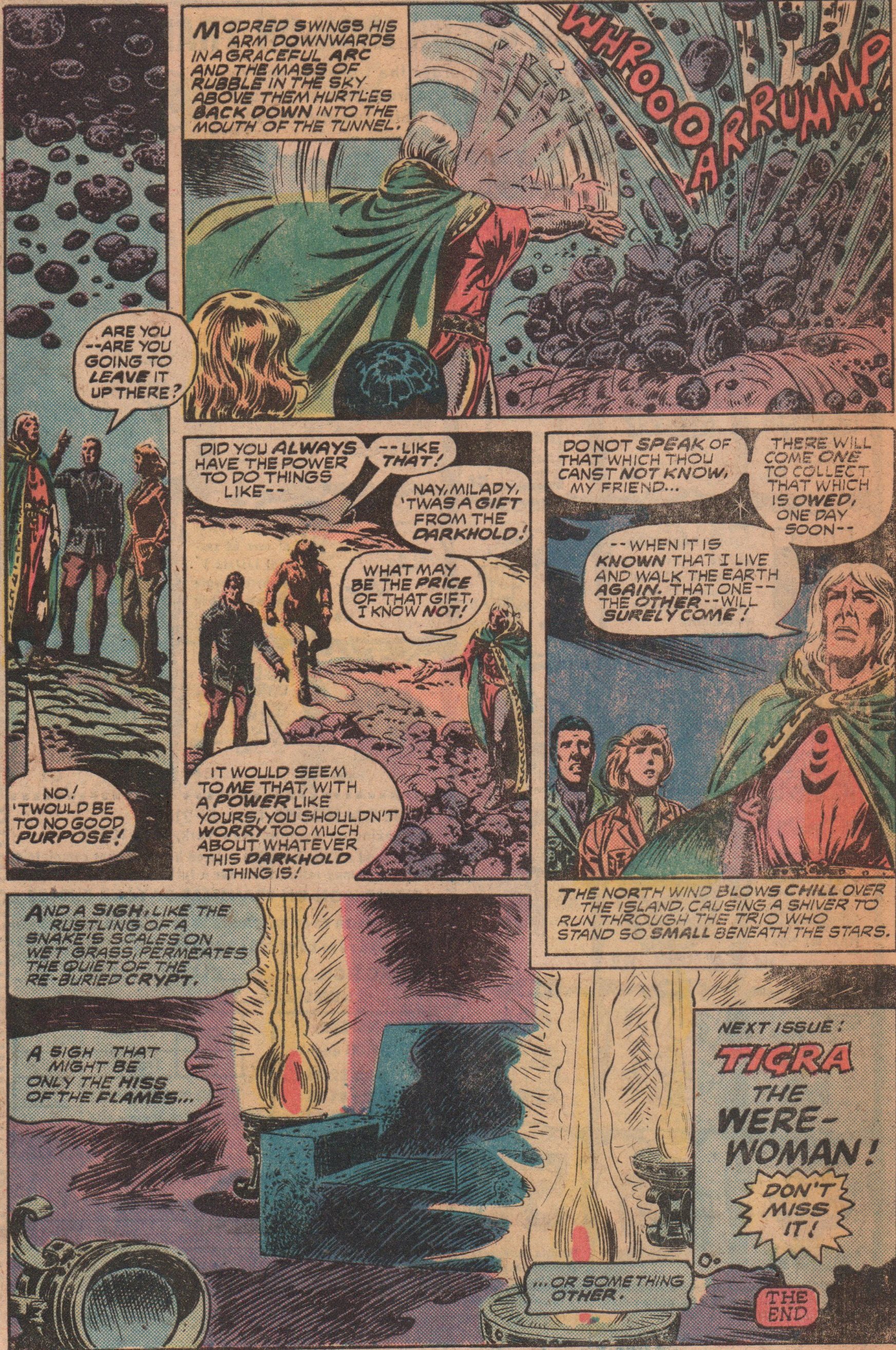
Marvel Double Feature #19, 1976 “A Time to Die–A Time to Live!”

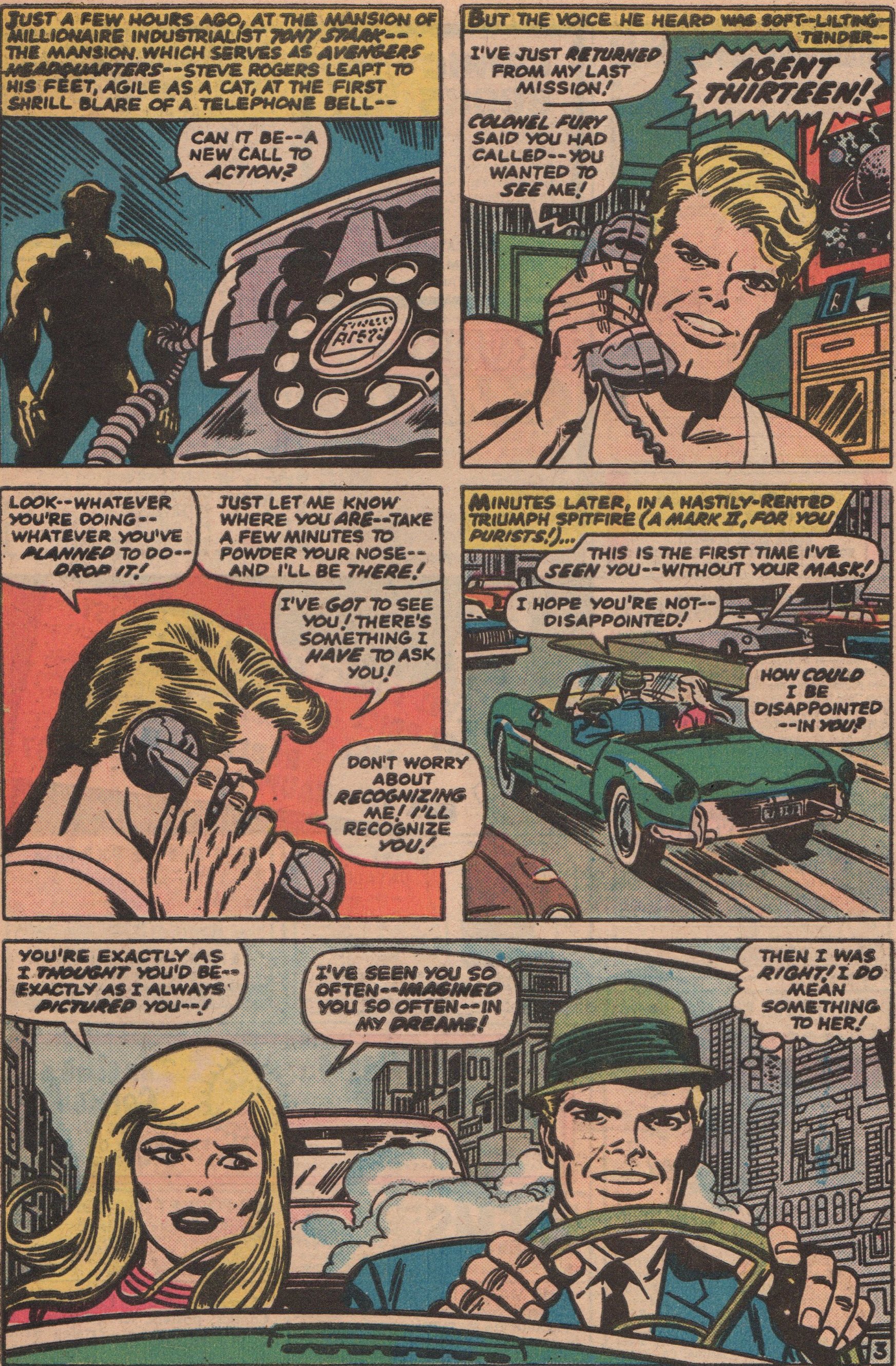
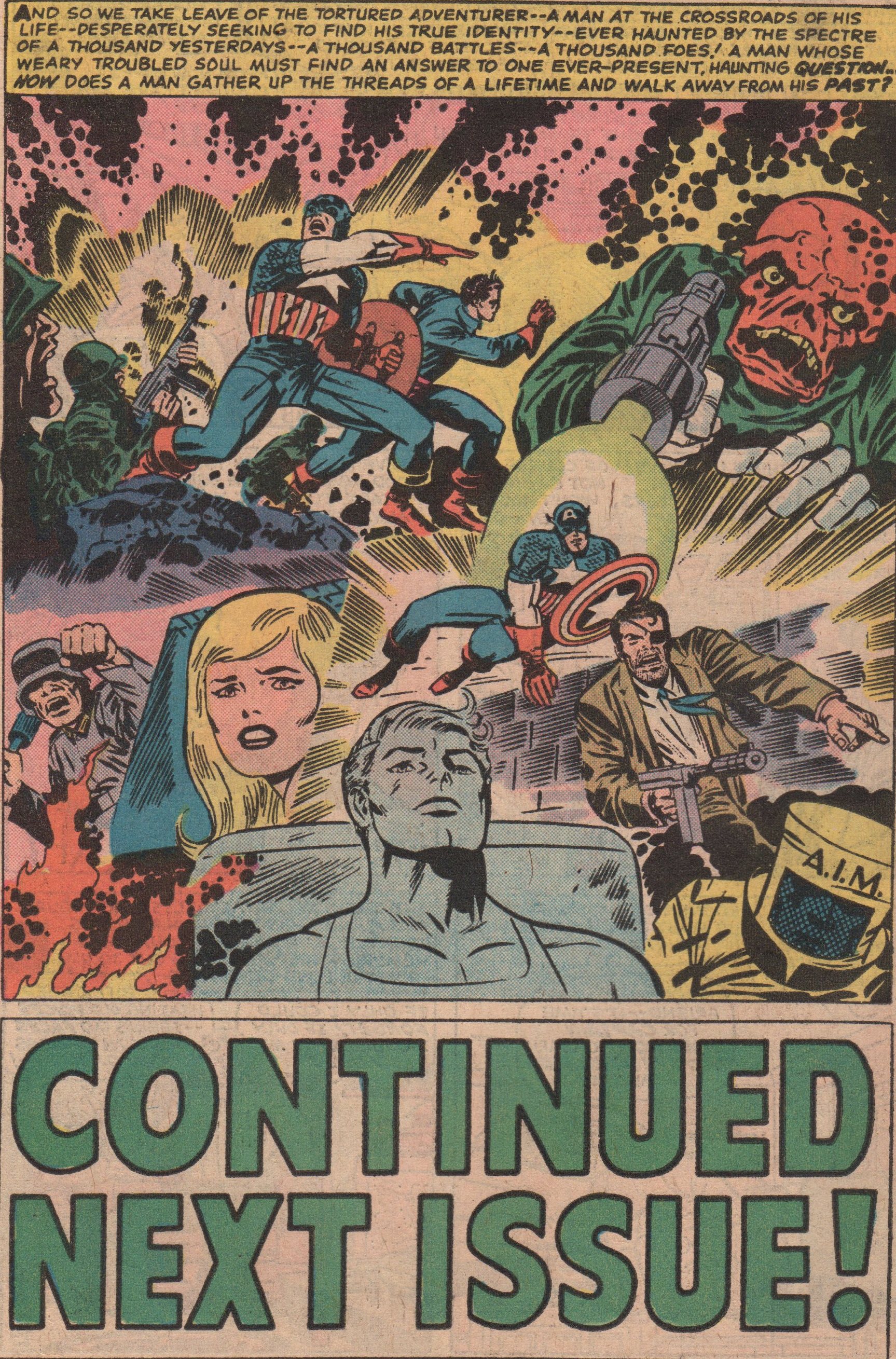
As time marches on, back issues from the Silver Age and even the Bronze Age are creeping up in price. The scarcity of these gems is becoming a fact, and it drives the prices up. This is why I choose to go the route of reprints (the majority of the time)! Yeah, sometimes the colors are muddled with or the covers are tweaked, but I can live with that, as long as I get to read these marvelous books. In this fantastic issue, we get not only get a Captain America story, but also Iron Man! Both are classics, and have great creative teams behind them.

Speaking of creative teams, is there anyone that drew Captain America better than Jack “King” Kirby (cover and interior pencils)? Others have done fine work (Byrne, Romita, etc.), but no one seemed to really capture the essence of the character quite like the king! And who better to ink this story than “Joltin'” Joe Sinnott! Written by Stan Lee, and lettered by Artie Simek. The second story, was written by “Amiable” Archie Goodwin, the pencils by Gene “The Dean” Colan, inks by Johnny Craig (yeah, that E.C. Comics legend!), and letters once again by “Adorable” Artie Simek!


img310

img311

img312

img313

img314

img315

img316

Spectacular Spider-Man #85, 1983 “The Hatred of the Hobgoblin!”

I don’t have very many issues of Spidey stories from the 1980’s for some reason. Just a few scant issues, but issues that have a very good story and creative team behind them. In this story, we see the “birth” of the Hobgoblin! Roger Stern was the architect of this character, and he really turned up the drama and mystery during his run on the book. Some consider his run right up there with the all time greats, and after reading some of it, and listening to a podcast about Spidey in the 1980’s, I’d have to agree. The underworld/crime stories, and the presence of the mysterious Hobgoblin (we/Peter didn’t know who he really was for a few years!), really make this a memorable time for the old web-head! This issue also has a softer side, as Harry and Liz announce that they’re expecting their first child (little Normie)!

The story was written by the often overlooked Bill Mantlo (some plot credit to Stern?). If you look at this man’s credits, he was one of the builders that helped keep Marvel going for a decade. Between ROM, The Micronauts, and all the short runs and fill-ins he did, you’ve got to respect his place in the industry’s history. The artwork was by the team of Al Milgrom and Jim Mooney, and both of those men are also a big part of the Bronze Age (and Copper Age) of comics. With the colors by Bob Sharen and letters by Diana Albers, the team is in place. Get ready for action, and love (with The Black Cat) for Peter Parker!


img280

img281

img282

img283

img284

img285

img286

Tales of the Zombie #3, 1973 “When The Gods Crave Flesh!”

I have a new passion for a certain comic book that wont stop gnawing at me. The black and white horror magazines from the 1970s are very hypnotizing; from the fantastic artwork, the wild stories, and the overall more mature tone are really exceptional. I’ve already talked about the first issue of these that bought a while back (Monsters Unleashed #11), and that one really hooked me into the genre. I was already a fan of most of the creators that worked in this era, and saw some work from creators I’d never seen before (Billy Graham, being one). In this great issue, we start out with a story starring the one and only, Simon Garth (the Zombie)! There are four other stories (one reprint maybe?) in the issue, but this first one definitely stands out the most, as you will see!

Legendary writer, Steve “Baby” Gerber wrote the Zombie story, and with artwork by “Prolific” Pablo Marcos, you really get the best of what these magazines had to offer. Throw in more artwork by long time artists Tony Dipreta, and Bill Walton (both Golden Age alumni), and more stories written from talents like “Devil-May-Care” Doug Moench and Tony “The Tiger” Isabella, and you get an incredible book! Let’s be honest though, you’ll fall in love with this one just from the Boris Vallejo cover alone (a definite shout out to magazine editor, “Marvelous” Marv Wolfman, as well!)!


img221

img267

img268

img269

img270

img271

img273

img274

img275

img276

X-Men King Size Special #2, 1971 “Divided We Fall!”

As the Silver Age drew to a close, the X-Men went the way of the Do-Do bird. A few scatter-shot appearances (like a good one in Marvel Team-Up #4), and, reprints! The numbering continued from the original series with nothing but reprints for quite a few years before the Wein-Cockrum-Claremont team took over. One of those books was basically an Annual, or King Size Special, in this case. The Annual reprints two issues (#22 & #23), that are a two=parter featuring Count Nefaria! And Nefaria has recruited five villains to help him in his quest to destroy the X-Men!

Following the Lee/Kirby beginning, Roy Thomas (writer) took the reigns, and with a few different artists (until his collaboration with Neal Adams) kept the train rolling for a while. Artist Werner Roth (under the pseudonym Jay Gavin), started out penciling over Kirby layouts, then moved on to taking on the job himself. The incomparable Dick Ayers was the inker, and Sam Rosen on letters! A solid cover by Marie Severin (pencils) and John Romita (inks), put the finishing touches on the book! Some great action in this issue, and even a cool scene in the Danger Room!


img257

img258

img259

img261

img262

img263

img264

img265

Thor #201, 1972 “Resurrection!”

After Jack Kirby left Marvel, I’m sure there were some that were very despondent, both within Marvel, and fans. One of the books he left, was Thor. Most would probably say that the Fantastic Four or Captain America are his crowning achievements, but for me, I think Thor is right up there with anything he ever gave us during his time at Marvel Comics. So, the stage is set, Kirby is gone, and who can even possibly try to fill his shoes? Enter John Buscema! The man’s work is well documented, and for all the greats of his time, he stands tall, right there among them. In this issue, we see Odin brought back to life with the help of Hela! We also get a treat, and see the god of war, Pluto, as he battles Thor!

As I’ve already pointed out, this issue is a good one, and basically, you have two elements driving that fact. First is the great creative team of Gerry Conway (writer), “Big” John Buscema (pencils), Jim Mooney (inks), Artie Simek (letters), Gil Kane (cover pencils), and Vince Colletta (cover inks)! The second is the awesome continuity that had been put into place by Lee and Kirby, up until this point in the character’s history. Throw those things together, and you get a great title!


img251

img252

img253

img254

img255

img256

Marvel Adventures #1, 1975 “The Tri-Man Lives!”

I’ll be honest, Daredevil isn’t one of my favorite characters. I don’t dislike him, but he just doesn’t get me aroused. There are a couple of aspects about his life that I do like (his terrible love life, his relationship with Foggy), but overall, I find him slightly dull. There is always one reason to check out some DD though, and that’s because of Gene Colan. He was the first consistent artist on the book, lending his pencils to over 80 issues of that title (the 1964 original run). He penciled one of the most socially significant stories of the decade in Daredevil #47, “Brother Take My Hand.” In this reprint book we see issue #22 shown again. The story centers around three villains, the Tri-Man, The Gladiator, and The Masked Marauder! Now, granted these guys aren’t the cream of the crop in the villain category, but Colan makes them look very menacing!

At this point, DD was still in his infancy, so Stan Lee was writing the book (as he was contributing to most scripts back then (1966). Initially, the book had a couple of different legendary artist (Bill Everett, Wally Wood), but it wasn’t until Gene “The Dean” Colan took over on the book that it had the great consistency it lacked. The inks in this one were provided by two men that were absolute stalwarts in the Silver and Bronze Ages. “Fearless” Frank Giacoia and “Darlin'” Dick Ayers, were both excellent inkers that are legends in the industry. The colors were provided by Stan Goldberg, and letters by Sam Rosen.


img243

img244

img246

img247

img248

img249

img250

Marvel Chillers #1, 1975 “Magic is Alive!”

I recently attended a small comic convention, and grabbed a few good books for a decent cost. Nothing high-end, just a couple of black and white mags, and a few key issues from the Bronze Age (well, key to me anyways). One of them being Marvel Chillers #1! This was the first appearance of a pretty important character during this era, Modred the Mystic. He would go on to plague the Avengers, and especially be a part of the Scarlet Witch’s life for a while. In this issue we see his origin, and more about the Darkhold and Wundagore Mountain!

With a number one issue like this, the cover really doesn’t need an “A” team, but it has one anyway! Artists Gil Kane (pencils), and Tom Palmer (inks) supply a fantastic cover for this one! Inside you get work from Bill Mantlo (script), Marv Wolfman (plot), Yong Montano (pencils), Ed Hannigan (pencils), John Romita Sr. (inks), Petra Goldberg (colors), Tony San Jose (letters), and Frank Giacoia (inks)! With a crew like that, this one is a can’t miss!


img231

img233

img234

img235

img236

img237


The Spectacular Spider-Man #50, 1981 “Dilemma!”

As most comic book readers know, the Amazing Spider-Man was the flagship title, and almost always had the best stories. Every once in a while though, the sister title, Spectacular Spider-Man would churn out something cool. It had its share of solid creators working on it, and usually dealt with something a little more off-beat. This particular issue shows Spidey, as he’s wrapping up capturing the villain from the previous issue (the Smuggler), but his night gets a little crazier than he thought it would. After finally packing up the costume for one night, Parker decides to call Debra Whitman and ask her to accompany him to meet Aunt May’s new beau, Nathan Lubensky for dinner the following day. We see that Debra has some pretty deep feelings for Peter, but we know his mind is elsewhere. The story has some nice little moments, and is definitely one that you should seek out!

Anyone that lost track of Spidey after the tumultuous Silver Age is really missing out on some great stories. Everyone knows of the excellence of Gerry Conway, but a couple of other scribes did the old web-head justice as well, and one of them is certainly Roger Stern. He wrote this story along with a few others in this title, and later took over the main title as well, and really made strides in the life of Peter Parker and his surrounding cast (Mary Jane especially). The art team is a great one too, and we have “Jubilant” John Romita Jr. (pencils), and Jim “Madman” Mooney to thank for that. The colors were provided by Ben Sean, the letters by Jim Novak. Your eyes do not deceive you, that is a cover by “Lanky” Frank Miller and Joe “The Rube” Rubinstein!


img213

img214

img215

img216

img217

img218

img219

img220

Marvel Chillers #4, 1976 “Night of the Huntress!”

For a time, Marvel tried to further its reading base by creating some books that had  female protagonists. One of those characters was “The Cat,” Greer Nelson. She was featured in her own short-lived series, and after became an Avenger. She eventually mutated into a tiger-woman, named Tigra! She also had a stint in Marvel Chillers, and in this issue, she battled none other than Kraven the Hunter! We all know that Kraven is a bad mamma jamma, but don’t worry, Tigra can hold her own!

The creative team on this one was unique as this was the only issue they all worked on  (writer, pencils, inks) in the series. You have X-Man supreme, “Clever” Chris Claremont (writer), “Free-Wheelin” Frank Robbins (pencils), “Valiant” Vince Colletta (inks), John Costanza (letters), and George Roussos (colors), that gave us this gem! Oh, and let us not forget editor “Marvelous” Marv Wolfman, and “Jazzy” Johnny Romita (pencils), and “Terrific” Tom Palmer (inks), with the cover!


img207

img208

img209

img210

img212

Black Goliath #5, 1976 “Survival!”

The 1970’s had such an eclectic selection of comic books, that looking back, you can’t deny the place it has in history. It’s understood that without the Golden Age, and Silver Age, things wouldn’t have turned out that way, but that fact doesn’t diminish the greatness of the Bronze Age! Take for instance, the title, Black Goliath. In only five issues, it gave us a superhero of color, and one that was definitely a strong character. If you look back, that was something in short supply. The scientist, Bill Foster, was an employee of Stark Industries, and later became the scientific partner of Hank Pym. In this, the final issue of the series, Foster must do battle with a giant alien savage named Mortag! And also protect two others with no superpowers!

The story is pretty good, and with someone like Chris Claremont writing, you kind of expect it after all he’s done. The artist is the terribly underrated Keith Pollard (a guy I’ve spotlighted before on my blog). He had a good run on the Fantastic Four, and Thor, and if you check out those issues, you’ll be impressed. The colorist is Bonnie Wilford, and the letterer, Irv Watanabe. The short-lived editor, but always reliable writer, Archie Goodwin rounds out the team! Oh, and let us not forget the action packed cover by the master, Gil Kane (pencils) and another Marvel stalwart of the era, Al Milgrom (inks)!


img200

img201

img202

img203

img204

img205

img206