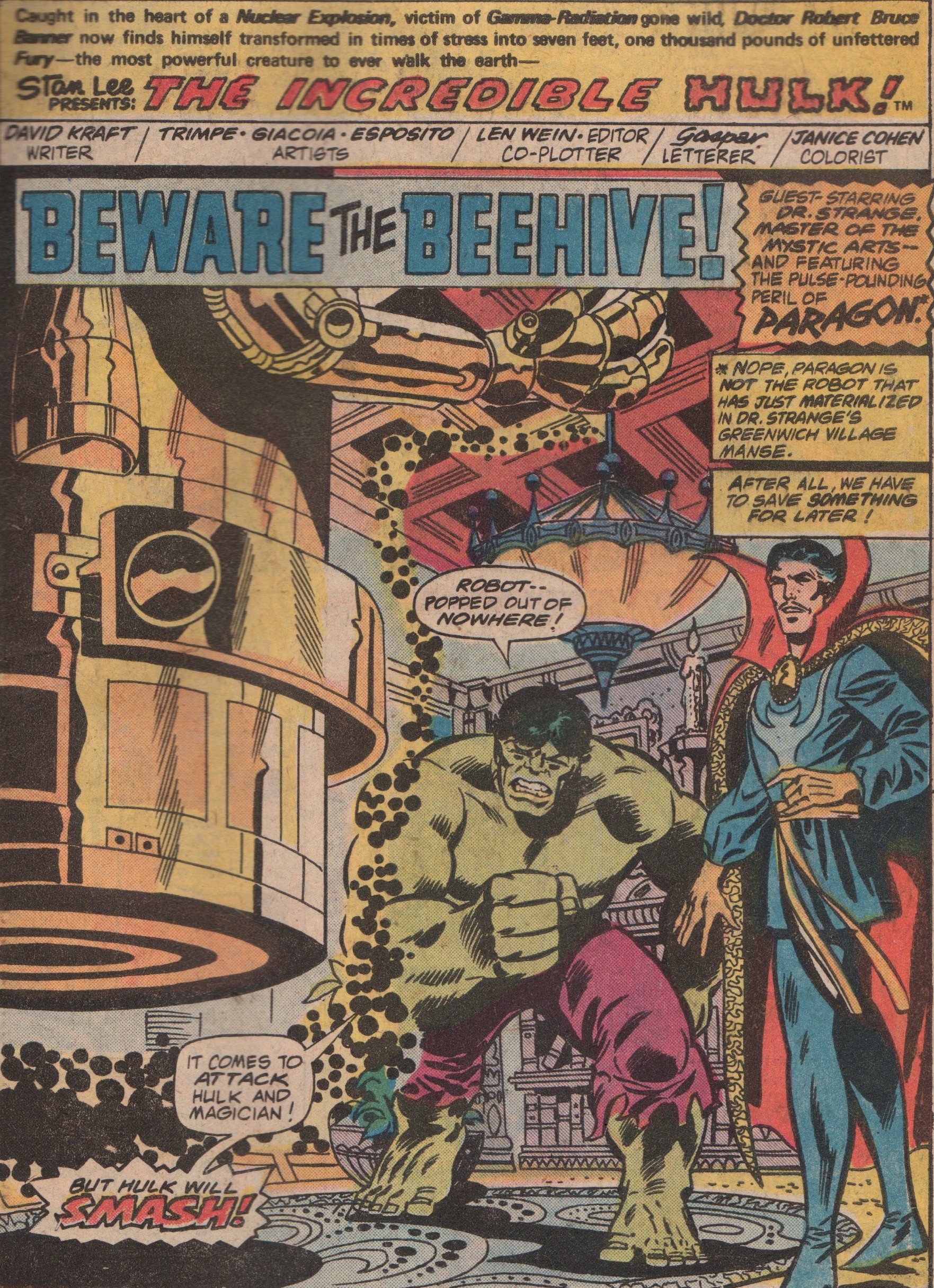
Machine Man 2, 1978 “House of Nightmares”

When Jack “King” Kirby returned to Marvel in the mid-1970s, not only did he spend time on an old favorite, Captain America, but he also created some new characters that were absolutely mind-blowing. One at the top of the list has to be Machine Man. An android created by a scientist, that in turn was killed trying to remove the auto-destruct mechanism from him. Machine Man was introduced in the pages of 2001: A Space Odyssey (issue 8, 1977). This was another Kirby vehicle that was initially based on the film (Stanley Kubrick) and novel (by Arthur C. Clarke). Kirby eventually took the book in his own direction though, and brought more of his Bronze Age bombast with it.

Kirby eventually left Marvel in 1978/1979 (after issue nine of this series), but the title did go on for a few more issues with Steve Ditko on art. It was interesting, but not the all out craziness and cool of Kirby (some of that was definitely the writing, too).  But we did get this awesomeness from the King for those first nine issues, and how glorious they are to behold! Written, edited, and penciled (cover as well, with possible inks by Mike Esposito) by Jack Kirby, inks and letters by Mike Royer, and colored by Petra Goldberg!


Advertisement

Our Fighting Forces 126, 1970 “Losers in a Lost Town!”

For November, its been brought to my attention (via Twitter), that there is a hashtag (#warcomicsmonth) spotlighting military comics such as Our Fighting Forces and the entire genre! This is a genre that I didn’t really get into until the last decade, but it’s one that is chocked full of brilliant work by some of the best creators in comic book history!

In the Marvel vs. DC debate, there is a lot of room for speculation and conversation on which company is best as far as content over the years. If you look at each genre, rather than overall, you can see a pretty wide gap in a the war/military comics corner. DC comics had several great titles, and certainly the better between the two comic book giants.

This book contains three stories (plus some extras), and the first stars that lovable group, The Losers! Captain Storm, Johnny Cloud, Gunner, and Sarge, are always finding themselves in situations with seemingly no way out, but always manage to find a way to survive and get to the next mission alive! Written by Robert Kanigher, with art by Ross Andru (pencils) and Mike Esposito (inks). The second story gives us perennial war comics giant Sam Glanzman (script, pencils, inks)! If you’ve never seen one of his stories before, definitely grab some of his material. A one page story/pinup by Ken Barr (script by Raymond Marais) about Atilla the Hun, is a cool piece for sure. Another one page story, this one by John Costanza, brings some humor to the book for a slight change of pace. And lastly, Great Battles of History brings us The Fall of Constantinople! Art by Ric Estrada! All of this is hidden beneath a wonderful cover by the master himself, Joe Kubert! You’ll be seeing a lot of his covers in these war books, as he was a machine at pumping out very high quality work for DC comics for decades.


Marvel Team-Up 104, 1981 “Modok Must Triumph!”

Another “wacky villain” post here, and this guy probably isn’t considered wacky by most, but only because he’s a little more mainstream than the others I’ve typically spotlighted in my blog. Just on appearance alone though, you’ve got to admit that M.O.D.O.K. is weird. Now, throw in the Hulk Ka-Zar, and a boat-load of Dinosaurs, and you’ve got magic! You even get to see Ka-Zar take down a T-Rex*!

With all that’s going on in this book, it’s kind of a “can’t miss” for me personally. The Savage Land is a great setting for a comic book story, and Roger McKenzie (writer) delivers a good one. He completely understands how to articulate the way the Hulk and Ka-Zar communicate, fight, etc. Ka-Zar referring to the Dinosaurs as “thunder lizards” and the Hulk calling MODOK “big head,” are just two examples. Although Jerry Bingham (pencils) isn’t a well recognized name, he does a fine job in this book, and especially with MODOK. Mike Esposito (inks) is a Marvel stalwart from the Silver and Bronze Ages, as he kept books looking consistent and clean. Diana Albers (letters) and Christie Scheele (colors), round out the creative team on the interiors! The cover is by none other than Mr. Al Milgrom, and his rendition of the dinosaurs is awesome (edited by Denny O’Neil)!

(*note from the editor: no dinosaurs were hurt during the making of this comic book)


img962

img963

img964

img965

img966

img967

img968

Giant-Size Super-Heroes 1, 1974 “Man-Wolf at Midnight!”

Right smack in the middle of the horror explosion of the 1970’s, Marvel began to more regularly put its macabre characters into the mainstream superhero books as well.  Of course, there are good points and bad points about saturating books with certain characters, but I’ve always come down on the side of enjoying it. Honestly, how can you not like a book that pits Spidey against Man-Wolf and Morbius? You don’t get much of the classic conflict with Morbius in this issue (his original problem of not wanting to be a monster, you know a tortured soul type). We do however get that with John Jameson, as he’s been recovering from his bout with Spidey and his inner conflict.

At this point, Gerry Conway (writer) was firing on all cylinders. Whether it was Spidey or any other book, he was consistently churning out good scripts for Marvel and DC comics during the Bronze Age. There aren’t many art teams that can supersede Gil Kane (pencils) and Mike Esposito (inks).  These two creators worked great together, and you can really see their willingness to put forth their very best efforts. John Costanza (letters), Linda Lessmann (colors), and Roy Thomas (editor) round out the creative team (John Romita inking the Gil Kane pencils on the cover)!


img676

img677

img678

img679

img680

img681

img682

Marvel Team-Up Annual #4, 1981 “Power Play!”

Every good comic book has several elements in it. A solid story is the first thing, and a great art team is a big boost, but you absolutely must have at least one comedic moment within the pages. When Spider-Man is involved, the writer has plenty of opportunities to make this happen. Throw in Power Man and Iron Fist, Daredevil, and Moon Knight, and the story has now the chances of being not only humorous, but also have pathos, and of course, altruism. Now, take all of those heroes, and add the nefarious Purple Man and the Kingpin of crime! Having these characters in the same book is all but a guarantee it will be good (it helps that the book is from a great era of comic books as well).

The name Frank Miller means different things to different people. Some immediately think of Daredevil (count me as one of them), some of The Dark Knight Returns. He’s done so much to transform the industry, I don’t think we’ll ever be able to appreciate fully the impact for years to come. He wrote this hilarious story (which shows he can do more than just gritty), and also penciled the cover, along with Josef Rubinstein on inks!  The interior art is by the team of Herb Trimpe (pencils) and Mike Esposito (inks). This was a very good team that is very rarely talked about, and that is a bit of a travesty. We see Diana Albers letters, and George Roussos on colors, as was the case with many books from this era (which gave an immense amount of consistency). Editing was none other than Tom Defalco (check out his work with Ron Frenz on Thor)!


img531

img532

img533

img534

img536

img537

img538

img539

img530

The Incredible Hulk Annual #6, 1977 “Beware The Beehive!”

This recent grab was…grabbed mostly for one reason- the appearance of Dr. Strange! Not that I don’t like the Hulk, I do, just more so in the pages of books like The Defenders, and The Avengers. I also love the “Beehive” and their insidious plots! In their second attempt at creating a god-like being, they unleash an even more powerful creature that initially tries to kill Dr. Strange! The old Doc has a difficult time with the man-made entity, but the Jade Giant is on his way to smash!

With a plot by editor, Len Wein, David Anthony Kraft (writer) gives us a story that is fairly simplistic but also solid in its delivery. No frills, just a slight mystery followed by straight up action! The art work by Herb Trimpe (pencils, the interiors and cover), Frank Giacoia (inks) and Mike Esposito (inks), give the reader a less rigid look than you typically get from Trimpe pencils (he usually has a more block-style, a la Kirby), and the inkers get credit for that, no doubt about it. Colors by Janice Cohen, and letters by Gaspar, round out the team!


img439

img445

img446

img447

img448

img449

img450

SGT. Fury #98, 1972 “Dugan’s Deadly Dozen!”

With Memorial Day in the rear-view mirror just slightly, I thought it would be cool to spotlight one of Marvel’s military comics from back in the day. None was better than the always entertaining, Sgt. Fury and his Howling Commandos!  This rag-tag group was always either kicking butt or making with the wise comments. Never a dull moment! In this tale, Fury is laid up, so Dugan must take charge, and whip these new guys into shape! A new class of recruits that are less than desirable need to be trained and it’s up to Dum Dum Dugan to do it! Also look for a special appearance by Nick Fury and Happy Sawyer!

This title always had great creators on it. From Roy Thomas, to Jack Kirby, and more. This issue however, is presented by the incredible team of Gary Friedrich (writer), Dick Ayers (pencils), Mike Esposito (inks), Artie Simek (letters), and John Severin (cover)! These fine creators did a copious amount of work on this title, and they really made it their own for a time. Well, sit back and relax, because this one is a real treat! Just look at the fantastic work by Ayers and Esposito!


img106

img107

img108

img109

img110

img111

img112

Captain Marvel #42, 1976 “Shootout at The O.K. Cosmic Corral!”

Taking a quick break from my look at Marvel Premiere, let us now see what the Marvel cosmic universe holds! As the Bronze Age rolled on, it was quite clear that Marvel was going to keep the cosmic train rolling, and heroes such as the Guardians of the Galaxy, Starlord, and of course, Captain Marvel! The creative minds behind this invigorating time were varying but exquisite nonetheless. In this particular story, we get to see not only the Kree man, Mar-Vell, but also Rick Jones, and the mysterious cosmic being the Stranger! One of the reasons I love this issue is because of the title. I’m a sucker for anything related to the old West, such as movies like “Tombstone” and the like. The scene in that film where the famous gunfight at the O.K. Corral occurs is fantastic, so the idea of naming this story after that event is doubly as cool!

The writer of this issue is none other than “Stainless” Steve Englehart! His abilities for concocting incredible stories are well-known, and anyone out there that doesn’t own first hand evidence of that, pick up his Avengers stories, Captain America, Dr. Strange, etc. The pencils (and plot assist) are by the ever reliable Al Milgrom (cover as well, with inks by Alan Weiss). This guy is very underrated, and when you look at the pencils, inks, plots, scripts, etc., you have to give the man his due. The inks are by two consummate pros, and no one can deny that Frank Giacoia and Mike Esposito are anything other than that. The colors are by Phil Rachelson and the letters by Marvel mainstay Tom Orzechowski!


Image (80)

Image (81)

Image (82)

Image (83)

Image (103)

Image (104)

Marvel Premiere #7, 1973 “The Shadows of the Starstone!”

As my look at Marvel Premiere rolls on, this next issue brings more intrigue with Shuma-Gorath, and the sorcerer supreme, Dr. Strange! After defeating three seemingly invincible foes recently, the Doc must now travel to Stonehenge, and then to some far out dimension to battle more horrors! This one has Clea, Wong, and others, as guest stars! The good Doctor must battle for his life, and soon, that of his aged mentor, as well!

Another issue written by Gardner Fox, this one starts out with one of the best lines ever in a comic book (Clea speaking)…”What is it that disturbs you, Stephen?” The artwork on the inside is a n incredible creative team. First, on pencils you have an artistic genius in P. Craig Russell. Next, you get inks by committee, with Mike Esposito, Frank Giacoia, and Dave Hunt! Those three gentleman are synonymous with the decade, and really do a great job on this issue. Jean Izzo was the letterer, and Mimi Gold, the colorist. One thing of note about the interiors is that the colors really pop in this issue. That was something that was outright awesome, and unseen before this time period. And if that wasn’t enough, you get another incredible cover by Mike Ploog!


Image (58)

Image (59)

Image (60)

Image (62)

Image (63)

Image (64)

Image (65)

Frankenstein #10, 1974 “”The Last Frankenstein”

After a short (but glorious) run, Mike Ploog handed over the reigns to the Frankenstein title. ‘Big’ John Buscema  was the man drafted to do the job (pencils), and did he ever impress! He didn’t do a ton of horror throughout his career, but when he did, it was impressive. I loved it when this title went off the reservation with its stories, because the sky was the limit. There could be a flashback story or one in present-day! This story involved an ancestor of the original Baron Frankenstein, and he wants to capture the Monster for a sinister reason that only he knows!

No matter who your favorite creative team is on this title, you have to love this issue! Gary Friedrich was the writer, and does a great job, as usual. His work on titles like this and Ghost Rider, are very solid. Of course, it doesn’t hurt when you have an illustrating team like ‘Big’ John Buscema and inkers Frank Giacoia & Mike Esposito, either. The colorist was Petra Goldberg, the letters by John Costanza. Carefully edited by ‘Rascally’ Roy Thomas, and cover by Mr. Gil Kane (inks by Romita)!


Image (14)

Image (15)

Image (16)

Image (17)

Image

Image (2)

Image (3)