Marvel Preview 22, 1980 “The Quest of the King”

The recent search for Marvel black and white magazines from the Bronze Age, has brought some interesting books to the forefront on the blog. The cover, being so awesome and naming the creative team was all it took. There’s also a fascination with Arthurian lore for sure, and quite honestly, isn’t everyone a part of that enthralling genre?

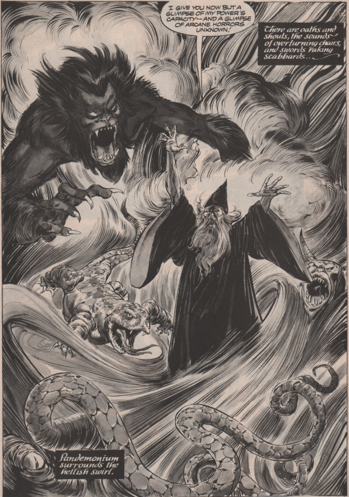
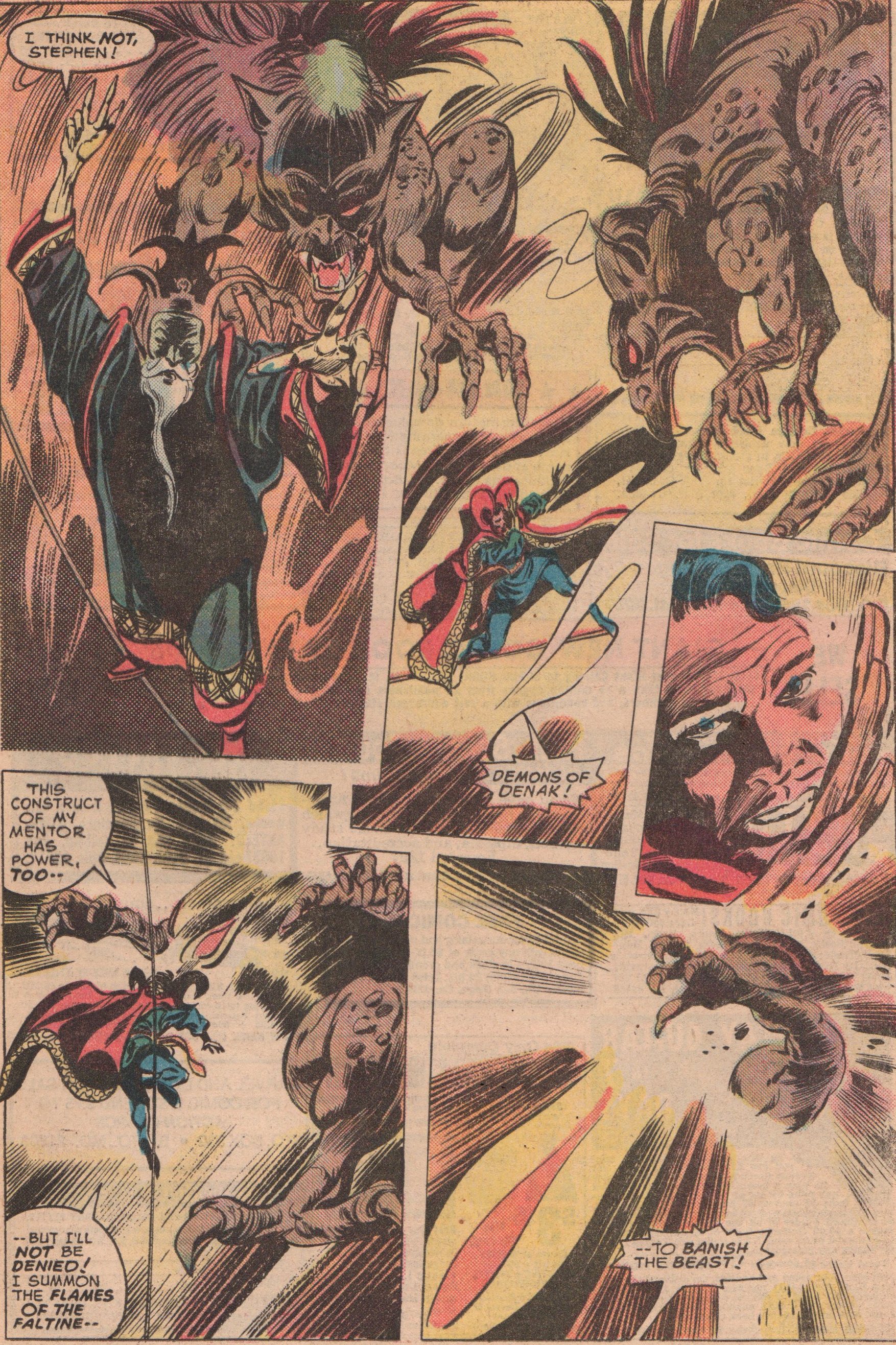
An adventure story involving knights, magic, and everything else you can think of is inside this book! Most mags from this era have multiple stories in them, but not here. This one is so strong it runs fifty-five pages long, and each one is a masterpiece by the creative team.

Speaking of the creative team, the familiar names from the ages are front and center. The artwork is off the charts in this book and we have Big John Buscema (pencils), and the inking team of Tom Palmer and John Tartaglione to thank. The story is by Doug Moench (script) and John Buscema as well! Not to be left off the list, is letterer John Costanza, who does a magnificent job on this one (calligraphy).


Advertisement

The Tomb of Dracula 25, 1974 “Night of the Blood Stalker!”

After spotlighting generic vampires, Morbius multiple times, and Dracula in a special issue and magazines, I thought it was well past time to dive into Marvel’s best horror comic of the decade (and all time), The Tomb of Dracula! Most probably know this villain from either the Universal film (starring Bela Lugosi), or the Hammer Studio films (starring the insanely menacing Christopher Lee as the count). The character has been embedded in our culture for a very long time (thanks to Bram Stoker). By the time the 1970s rolled around, and the comics code was loosened, it was high time for this horror giant to get his own series! This issue is a favorite of mine, as it features the first appearance of vampire detective Hannibal King, and my favorite panel of the series of all time (final image at the bottom).

Marv Wolfman (writer) has gone on record saying he really had no interest in writing this book, but as fortune would have it, he did anyway (starting with issue #7). He and artist Gene Colan (pencils) would work very close together on this title, and for seventy issues, they knocked it out of the park. Another reason the book succeeded was inker Tom Palmer. Colan has very intricate pencils, and quite a few inkers have had a tough time not drowning the pencils out, but Palmer was perfect for the job. Palmer also colored quite a few issues as well (including this one), and again you get a quality and consistency from a tight-knit team working hand in hand. The letters were provided by John Costanza. A lot of the covers were provided by the comic book giant, Gil Kane (Palmer on inks here as well). Kane’s incredible covers carried Marvel through most of the decade, and it just adds to his enormous breadth of work.


Doctor Strange Master of the Mystic Arts!

As we march forward to another season of Marvel movies (Black Panther is here, and The Avengers in May, followed by Ant-Man and Wasp), it’s a good time to put the spotlight on my favorite sorcerer, Dr. Strange! It seems he’ll be quite a big part of The Avengers film (and hopefully others!), and you never know what time period of the comics the creative team will pluck ideas from to insert in the films. One thing is for sure, in the late 1960s, Marvel released volume one of the good Doctor’s stand-alone series (after Strange Tales concluded), and it was fantastic!

Roy Thomas (writer) had already been at Marvel for a couple of years, and proved himself on the X-Men, The Avengers, and so on. His work here is just as powerful as it was on those titles. Artistically, the first few issues were drawn by Dan Adkins. Not a household name for those on the outside looking in at comics, but for those on the inside, he’s known as an excellent artist. He was then followed by Gene “The Dean” Colan (pencils) and Tom Palmer (inks)! These two gentlemen would go on to do many great issues together on several different titles (most notably The Tomb of Dracula).


X-Men Classics 1, 1983 “The Sentinels Live!”

Back in the Silver Age, the X-Men weren’t a big deal. The book just never seemed to be able to find an audience. The early issues were a bit tough to get through reading, but the Kirby artwork obviously helped. That said, after issue 66, it went into reprints. That’s the part that baffles me, since leading up to that last issue of new material (the title was cancelled and went into reprints for over four years, until 1975), the book was producing the strongest material to date by a long shot!

This fantastic reprint book shows us issues 57-59, with that incredible story with the return of the Sentinels! Of course that means Trask as well, but we also see the dangerous Mesmero too (and Magneto…sort of)! The interpersonal relationships between the team members is on full display in these issues for sure.

Roy Thomas (writer) was certainly a gifted writer and that was clear on any kind of book, but his keen sense on writing team books was certainly felt by the readers of the X-Men. He knew how to weave the personal nature of the X-Men and the real world applications together seamlessly. The team of Neal Adams (pencils) and Tom Palmer (inks) put on quite a show in these issues as they did in pretty much everything else they touched as creators during their storied careers. The colors were courtesy of Daina Graziunas. Throw in a great wraparound cover by Mike Zeck (and Palmer on inks again), and throw in some extra art by Adams as well, and you get to see a visual feast!


img568

img569

img570

img571

img572

img573

img576

img574

img577

img575

Moon Knight Special Edition 3, 1984 “A Long Way to Dawn” and “”The Mind Thieves”

Every once and a while, you get a comic book that reflects society, sometimes the bad parts of society that previously no one else wanted to show. Sometimes writers and artists have a tendency to ram messages about societal problems down a readers throat, and that of course is not a good thing. I won’t give any examples but in the 1980’s, you have plenty of comics that were critical darlings that weren’t very subtle in delivering a point about social issues. There are however titles like this one, that do an excellent job of showing things as they are for some people, and enlighten the people from the other side of the tracks on just how bad things can be.

When Doug Moench (writer) and Bill Sienkiewicz (artist) took over the reigns of the character Moon Knight, they made comics that were thought-provoking, edgy, and they did it without being overt about their intentions. Too many writers nowadays fall into the trap of beating the readers over the head with their own agendas, without ever considering whether they’re even remotely right or who they may alienate. Can you even imagine what these guys would create together in this day and age? The scary part is that there isn’t anybody in mainstream comics with the cajonies these guys had back in 1980! Pimps, drunks, drug addicts, and thieves, you get them all in this book!


img432

img434

img435

img436

img437

img438

A Tribute to Paul Ryan (R.I.P.)!

After learning of the recent passing of artist, Paul Ryan, I thought it most fitting to give him a grand send-off from my blog. I’d become friends with him on Facebook, and thought he was a very genuine man who had good values, and was a very under-appreciated artist. I don’t own any of his DC work, only some of his Marvel jobs. So, this one will be all Marvel! The first three are from the back pages of Marvel Fanfare 52 (1990), the rest are from various issues of the Avengers (inks by Tom Palmer)!  Godspeed, Paul!


img119

img120

img121

img136

img137

img138

img139

img140

img141

img142

img143

img145

img146


Doctor Strange 12, 1976 “Final Curtain!”

It’s no secret that Doctor Strange is my favorite character. His 1974 series is undoubtedly one of the most underrated series of all time. From start to finish it’s incredible. And let’s be honest, with creators like Steve Englehart, Gene Colan, Roger Stern, Jim Starlin, Tom Sutton, Marv Wolfman, Rudy Nebres, Paul Smith (and more!), you can’t go wrong! This particular issue deals with the Doc, as he’s about to be in conflict with Eternity himself, for the soul of his recently deceased master, the Ancient One! A flashback of the insidious Baron Mordo, and the Doc and Clea see the world die!

As the creative tag-team of Steve Englehart (writer) and Gene Colan (pencils) was beginning to wind down, one might think that the material might suffer, but this is not so. Both men brought their “A” game until the end of the run. It’s to be expected though, as both were consummate pros throughout their comic book careers. Another link in the awesome creative chain, is Tom Palmer (inks, colors). His work alongside Colan is legendary, even if you only look at this title or Tomb of Dracula. Yet another name synonymous with Bronze Age royalty is Tom Orzechowski (letters). He was a constant at Marvel and definitely earned his place among these other greats with his diligence. Throw in Marv Wolfman (editor), and the credits are full of amazing creators that gave their best!


img993

img996

img997

img998

img999

The Wedding of Dracula (1991- Originally 1974-76) “Blood Rites”

It’s time once again, to spotlight the best comic book title from the Bronze Age! Yes, you read that correctly. Not the best horror comic, THE best comic book, period. The Tomb of Dracula ran for 70 issues, from 1972 until 1979, and was without a doubt one of the best series ever. This little reprint book from 1992 has three issues in it. Two of the issues are back to back (45-46) and one is a standalone (30). The two consecutive issues revolve around Dracula using his influence on a satanic cult, and getting married. Good stuff, but I love the standalone issue better. That one shows Dracula reminiscing about some adventures he had in the past. One in particular where he meets a blind girl is quite fascinating.

The dream team of Marv Wolfman (writer), Gene Colan (pencils), and Tom Palmer (inks and colors), was in place for a while when these issues were published. They were on a roll by this point, and churning out fantastic stories. You add John Costanza (letters), and the crew is complete. This creative team would go on for 70 issues total in this series, and Wolfman and Colan would do more Dracula work in the future as well (Tomb of Dracula, 1991-92 – Epic, and The Curse of Dracula, 1998 – Dark Horse). Whatever the format, get out and grab one of the best books around!


img726

img727

img728

img729

img730

img731

img732

img735

img736

Giant-Size Man-Thing 5, 1975 “Hellcow!”

I know it’s heresy to say this being a big fan of Steve Gerber’s work, but I’m not really into Howard the Duck. That said, I do love horror stories, and most of them revolving around that character do fit into this genre. In this one for instance, we get to see Howard arrested, and in jail. The police are befuddled that a real duck is in their midst, and quite frankly have no idea what to do with him. The best part of the story lies with another character though, the Hellcow. Apparently, at a certain point in the life of Dracula, he swooped in and bit a cow. Normally, you don’t see animals come back as vampires but for some insane reason, this one does.

As I said above, Steve Gerber (writer) is nothing sort of fantastic. He can take the oddest of themes and turn them into gold. His work on The Defenders, Omega the Unknown, and several other books are all the proof that I need to prove that point. Another creator of this era that did incredible work, is artist, Frank Brunner (penciler). Even though he didn’t do a ton of work in comics, his impression on the industry is a lasting one, for sure. Tom Palmer (inks), Glynis Wein (colors), and Annette Kawecki (letters), finish off the creative team for this outstanding story! Of course, everyone knows of the fantastic work by Palmer, as he inked many books, and none more appreciated than his collaborations with Gene Colan in Tomb of Dracula!


img700

img701

img702

img703

img704

Doc Savage 8, 1973 “Werewolf’s Lair!”

Just for the record, I know virtually nothing about Doc Savage. That said, anytime you throw a classic monster in a comic book, I’m in! This wacky story reminds me of an episode of Johnny Quest (Werewolf of the Timberland) for several reasons. I wont get into them because it would spoil the issue, but you do get some good action, and some werewolf face-time as well. It’s part two of a story, so the circumstances leading up to this is lost on me, but that aside, it’s still very enjoyable. As the last issue in the series, you get the distinct impression it was cancelled abruptly because there’s no reference to cancellation at all.

As a whole, I like the work of Tony “The Tiger” Isabella (writer). He did some really cool horror stuff back in the early Bronze Age that’s worth looking up. The art team, led by “Riotous” Rich Buckler (cover pencils and interior layouts), are very solid. You get finishes and inks by “Terrific” Tom Palmer (Tomb of Dracula, The Avengers) and Jack Abel (GI Combat, Our Army at War) . Both men have had extensive careers in the industry, and proven themselves to be top-notch at their craft. Once again, the duo of “Titanic” Tom Orzechowski (letters) and “Genuine” George Roussos (colors), complete this list of comic book legends!


img586

img591

img592

img593

img594

img595

img587